R语言基础画图教程合集(长文总结)
前言
这一部分会简单分享一些R语言画图的小技巧,后续相应的代码以及测试数据文件都已经上传到百度网盘,可以在**公众号(生信技术)**留言回复“ R语言 ”获取。
R包安装
需要安装 ggplot2, qqman, gplots, pheatmap, scales, reshape2, RColorBrewer 和 plotrix(使用 install.packages(), 如 install.packages('ggplot2')
下面是后续需要用到的一些R包,如果需要新下载后面文章会继续介绍。
1 | library(ggplot2) |
加载数据
1 | # Read the input files |
保存并查看图片
如果要保存绘图,使用 pdf() + dev.off() 或 ggsave()。
第二个是特定于 ggplot2 包的(即,如果 plot 的代码以 ggplot 开头,那么可以使用第二个)。
让我们看一个例子:
pdf() + dev.off()
1 | # Begin to plot |
ggsave()
1 | # Begin to plot |
R包导出高质量可编辑图形
下面总结了一些输出高清可编辑图片的方式,更好的适用于科研投稿的高质量图片要求
-
SCI常见格式
-
矢量图和位图
-
ggsave函数(ggplot2包)
-
Cairo包
-
export包
1 | #高质量图形的导出 |
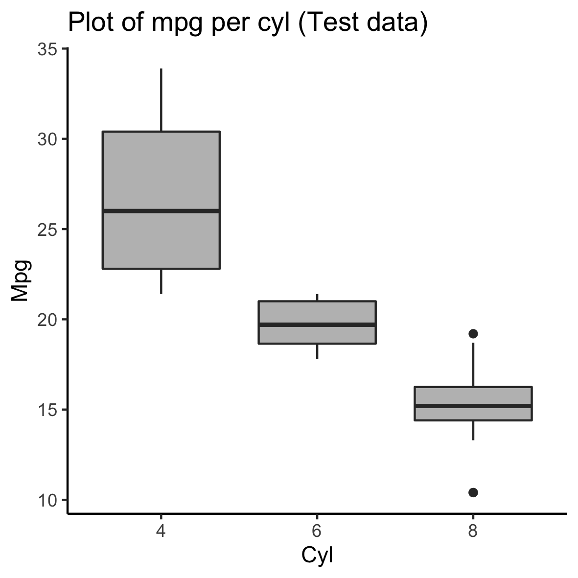
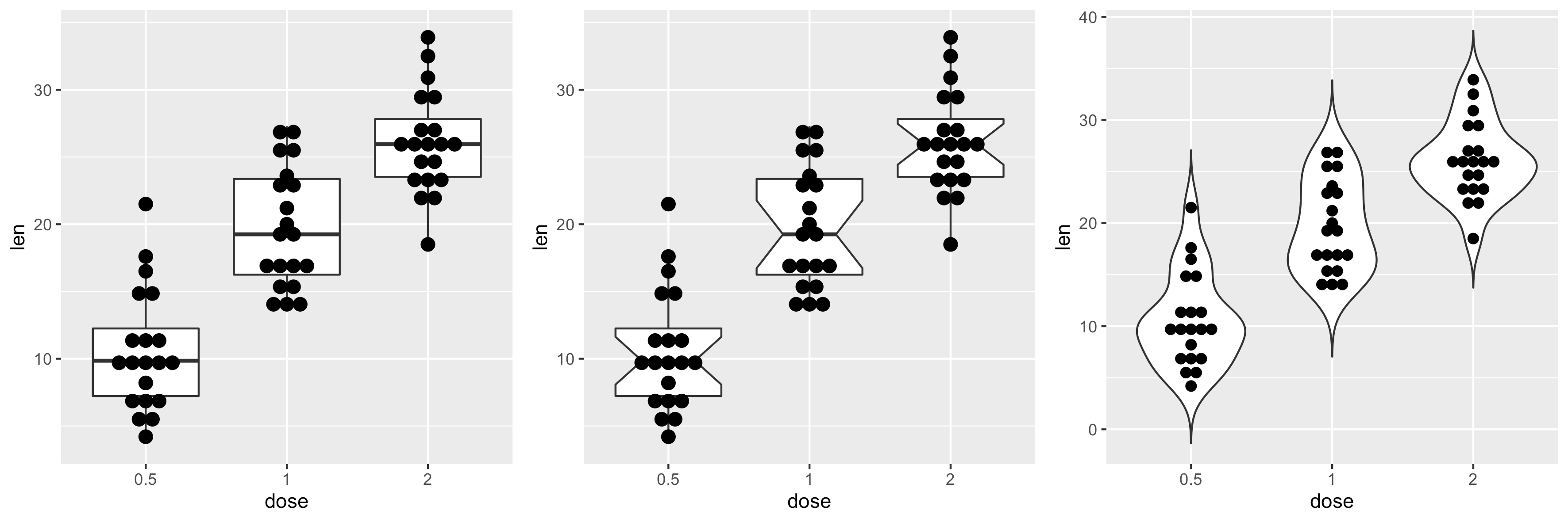
箱线图
基本箱线图制作
1 | > df$cyl <- as.factor(df$cyl) |
1 | ggplot(df, aes(x=cyl, y=mpg)) + |
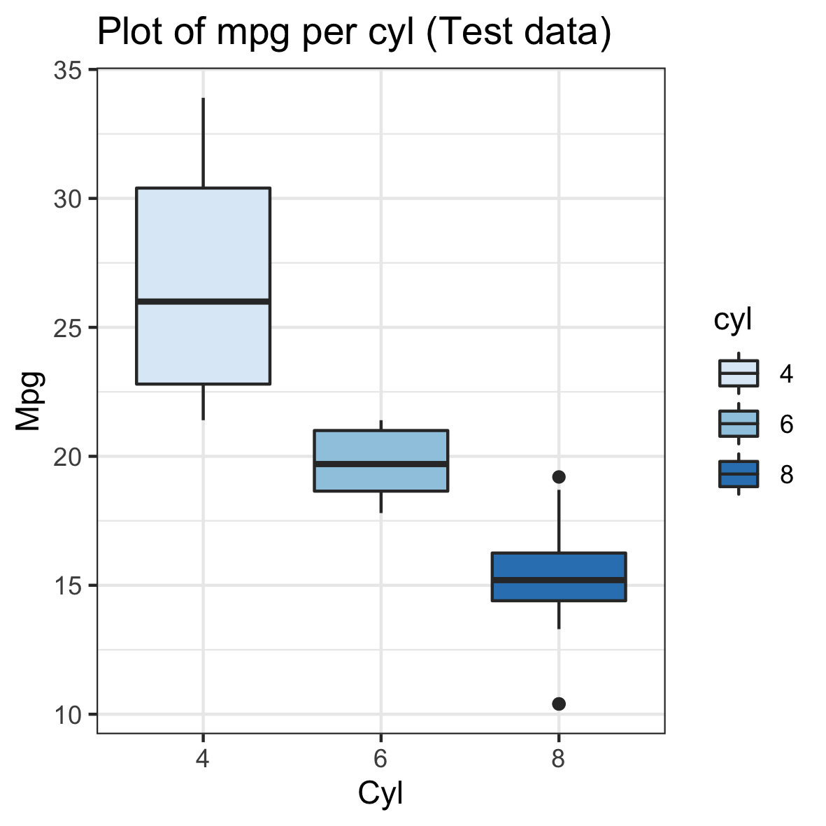
按组更改连续颜色
1 | ggplot(df, aes(x=cyl, y=mpg, fill=cyl)) + |
分组箱线图
1 | #Read the data table |
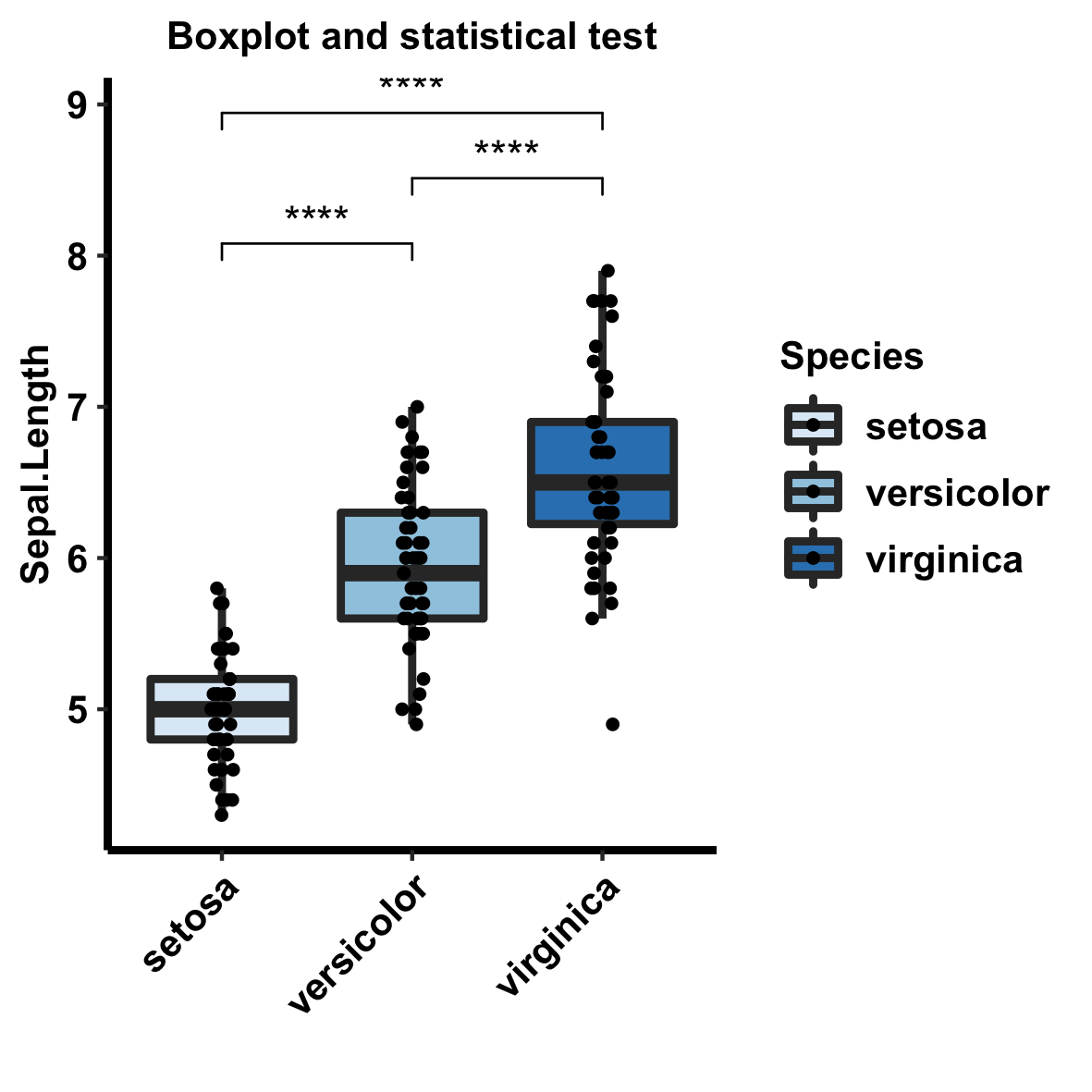
带统计检验的箱线图
1 | data(iris) |
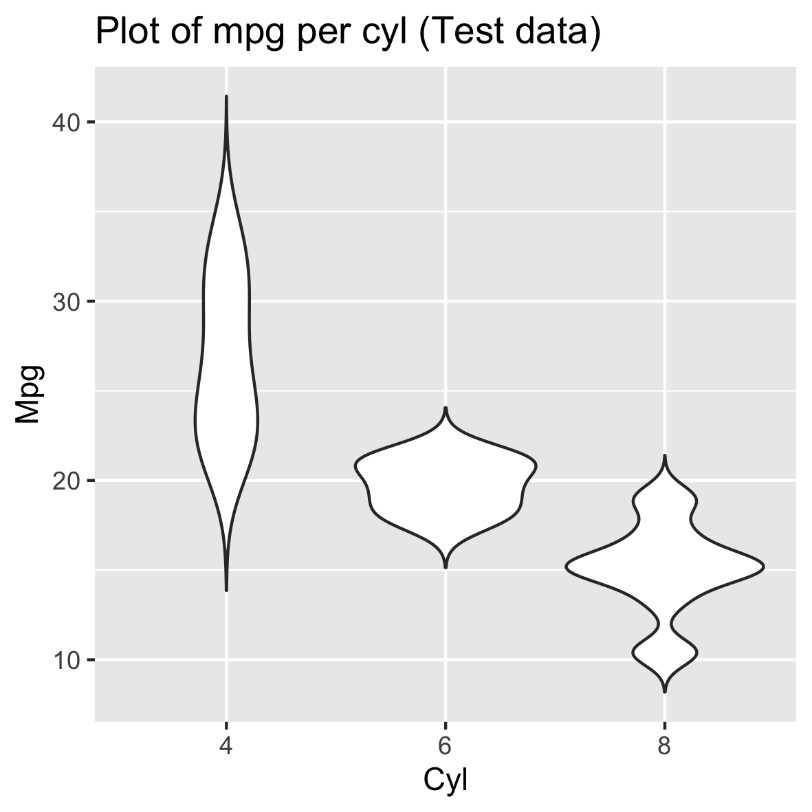
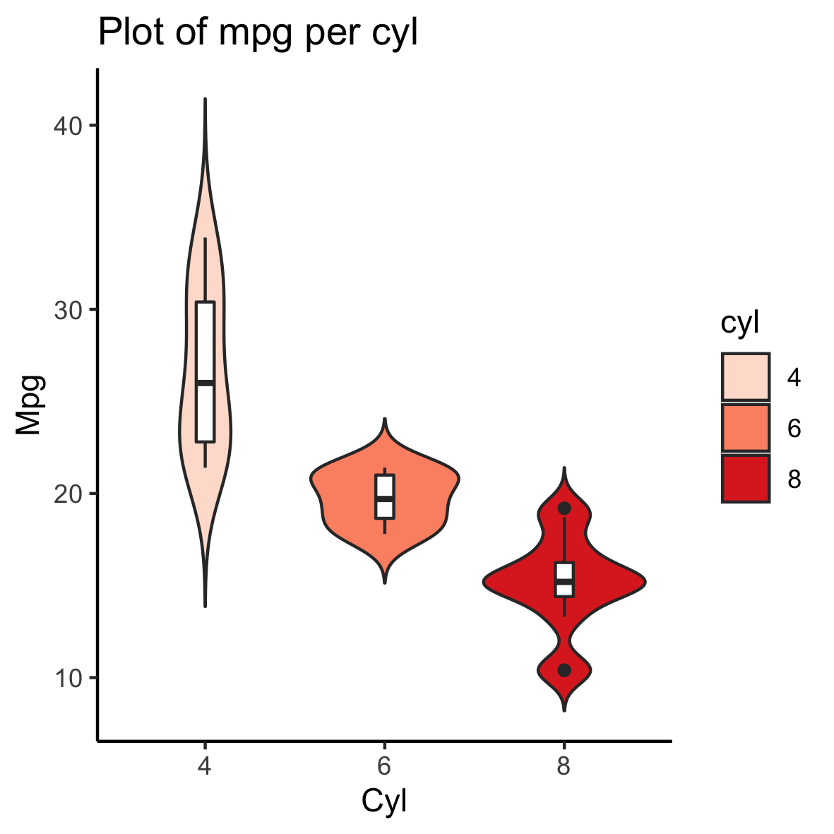
小提琴图
基本小提琴图制作
1 | > df$cyl <- as.factor(df$cyl) |
1 | ggplot(df, aes(x=cyl, y=mpg)) + |
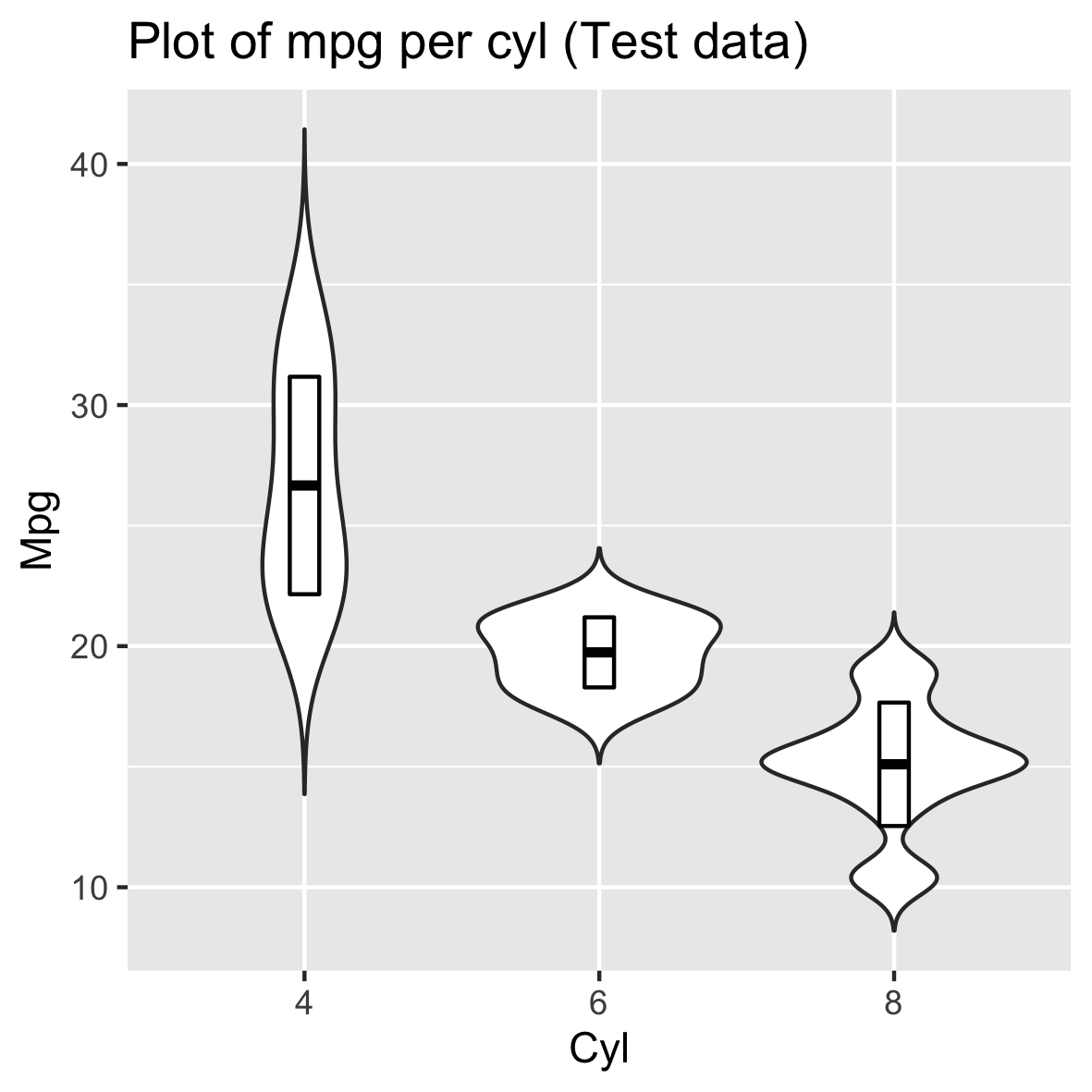
在小提琴图上添加汇总统计
添加中位数和四分位数
1 | ggplot(df, aes(x=cyl, y=mpg)) + |
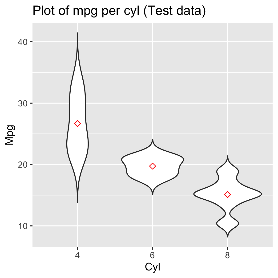
或者
1 | ggplot(df, aes(x=cyl, y=mpg)) + |
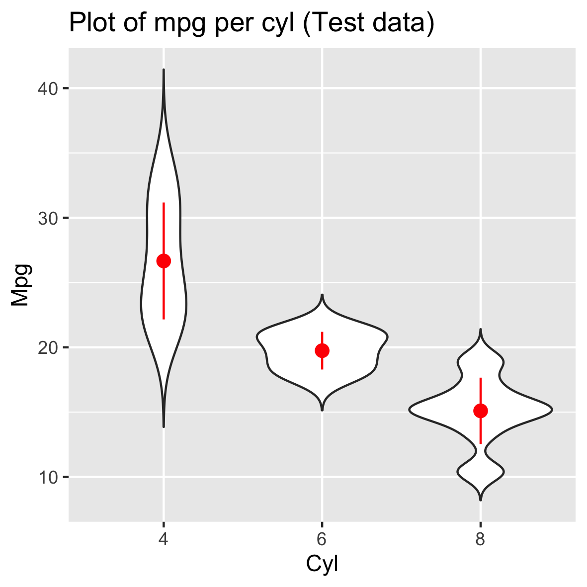
添加均值和标准差
1 | ggplot(df, aes(x=cyl, y=mpg)) + |
或者
1 | ggplot(df, aes(x=cyl, y=mpg)) + |
更改小提琴图填充颜色
1 | ggplot(df, aes(x=cyl, y=mpg, fill=cyl)) + |
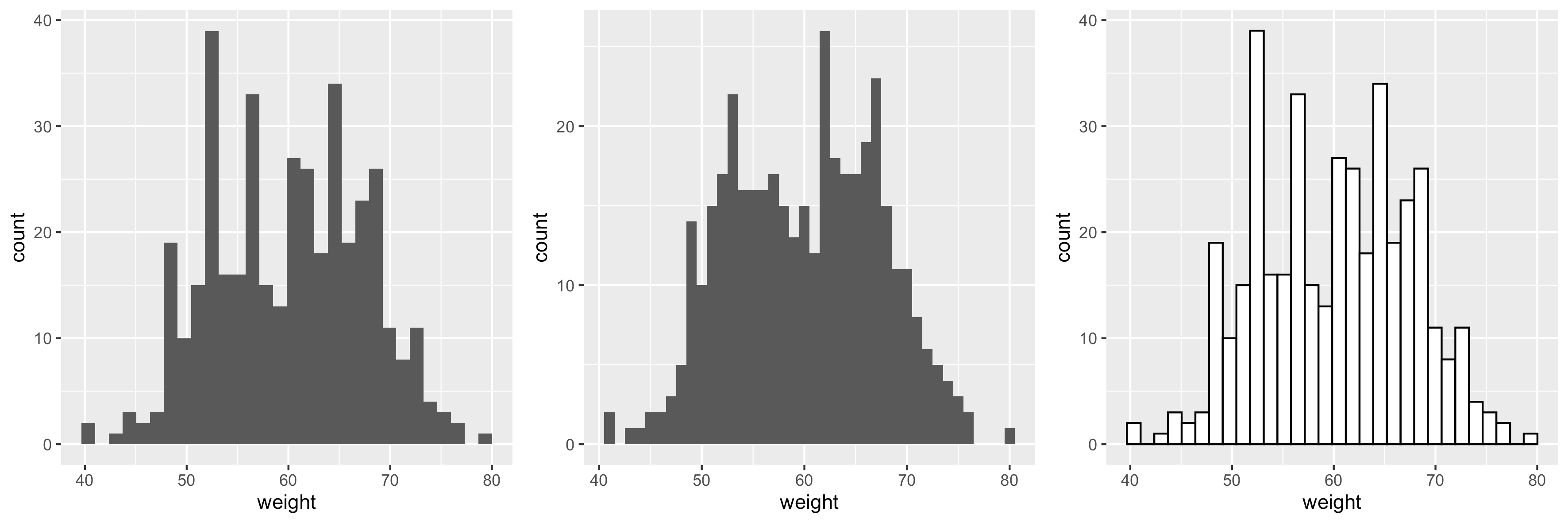
直方图
本R 教程介绍了如何使用 ggplot2 包创建直方图。
使用函数geom_histogram()
1 | df2 <-read.table("histogram_plots.txt",header=T,sep="\t") |
基础直方图制作
1 | > head(df2) |
1 | library(ggplot2) |
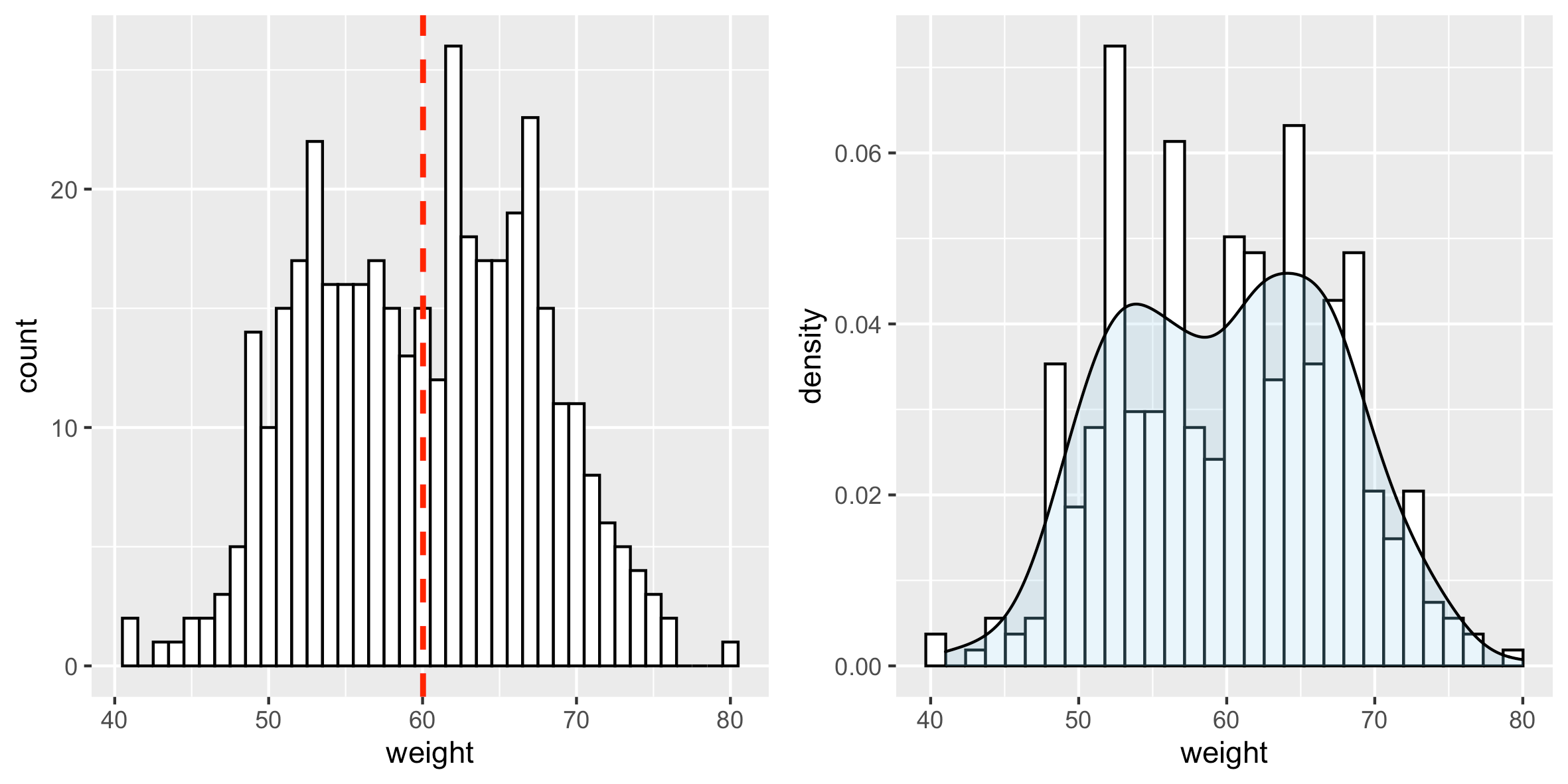
在直方图上添加平均线和密度图
使用函数geom_vline可以为平均值添加一条线。
1 | # 添加平均线 |
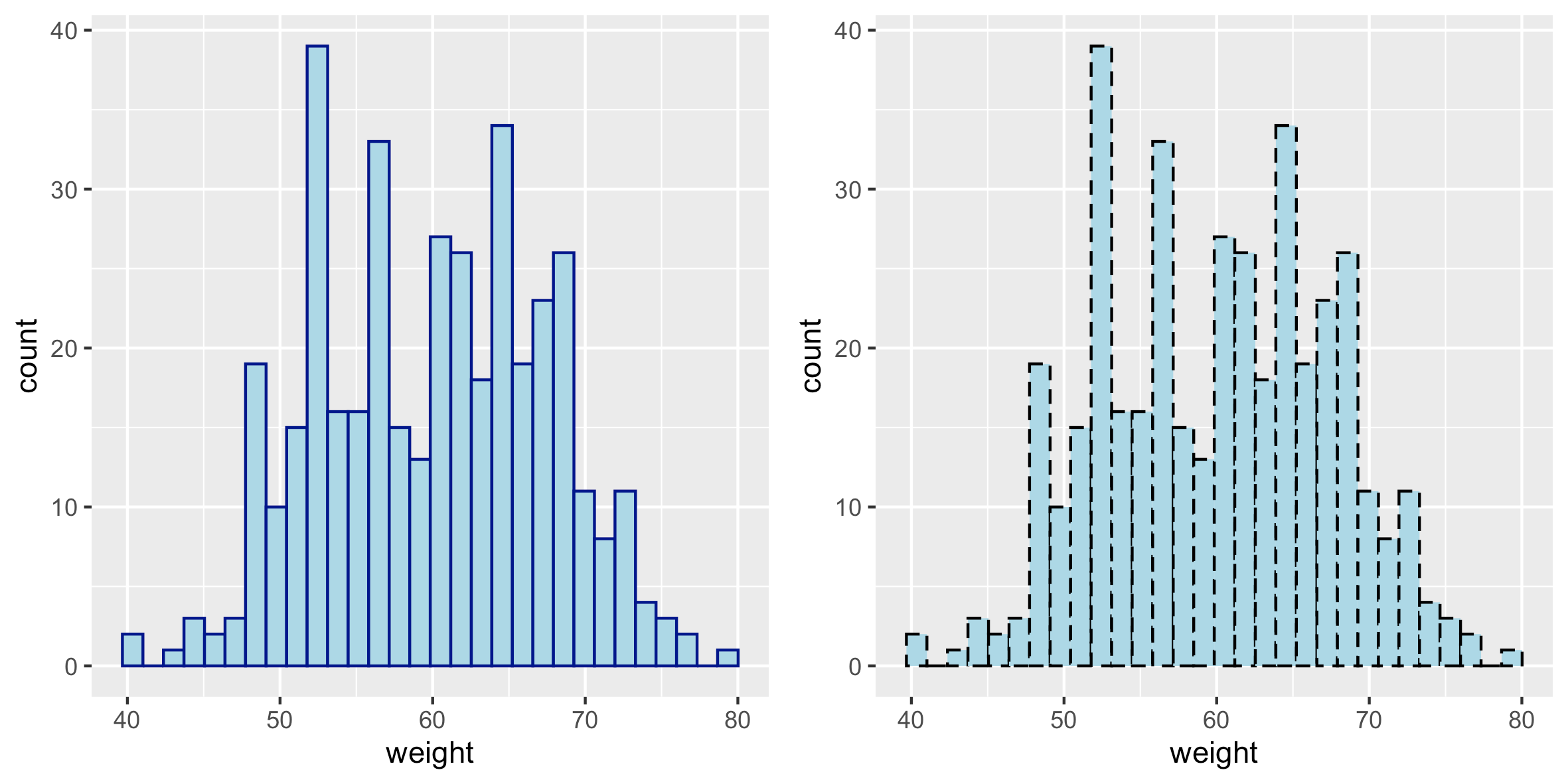
更改直方图填充颜色和线的类型
1 | # 改变线的颜色和填充颜色 |
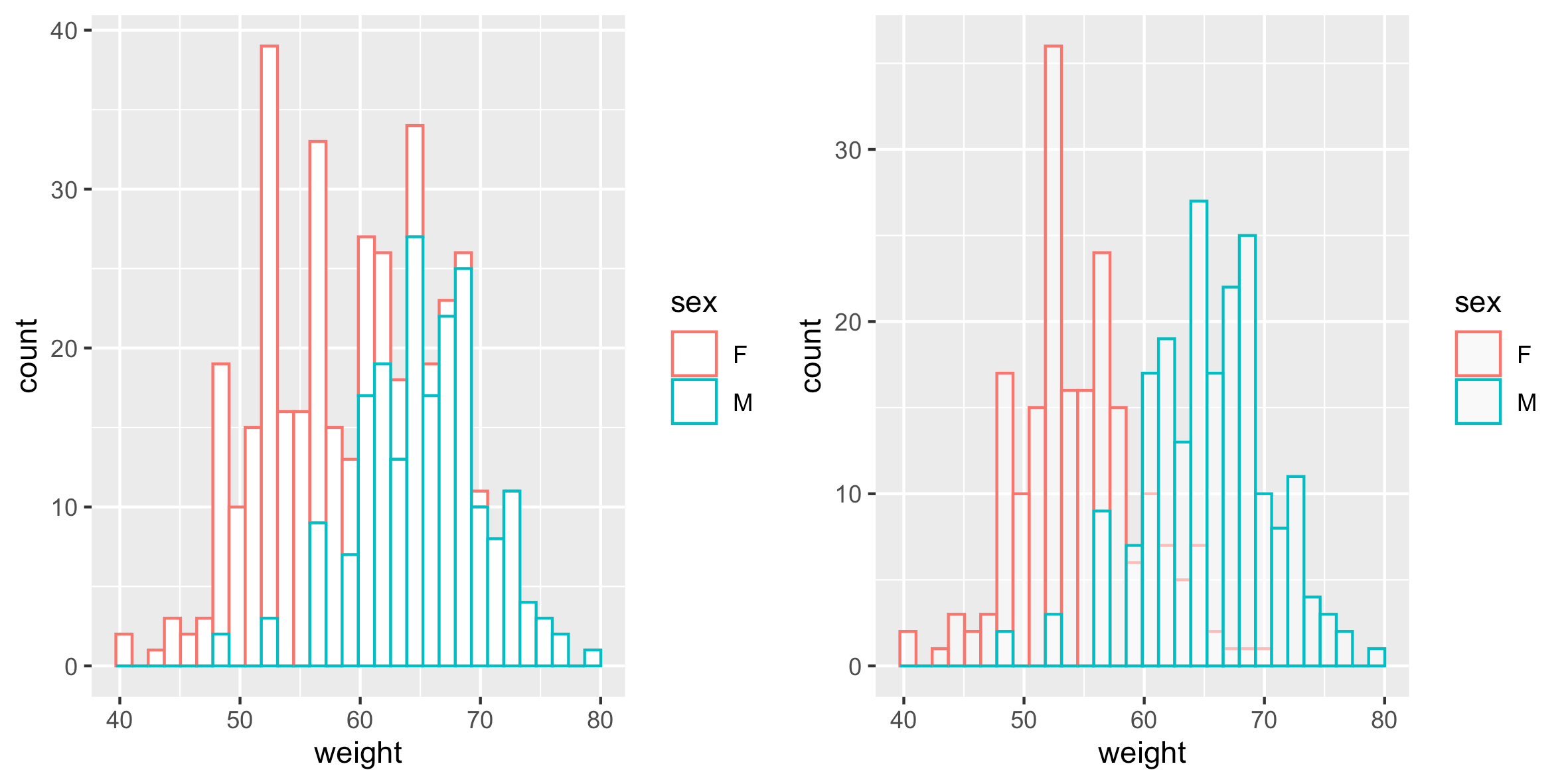
按组更改直方图颜色
计算每组的平均值:
plyr包用于计算每组的平均weight:
1 | library(plyr) |
更改线条颜色
直方图绘制的线条颜色可以通过变量sex的水平自动控制。
1 | # 按组更改直方图的线和填充颜色 |
1 | # 交错直方图 |
也可以使用以下函数手动更改直方图绘制线条颜色:
scale_color_manual() : 使用自定义颜色
scale_color_brewer():使用来自 RColorBrewer 包的调色板
scale_color_grey():使用灰色调色板
1 | # 使用自定义调色板 |
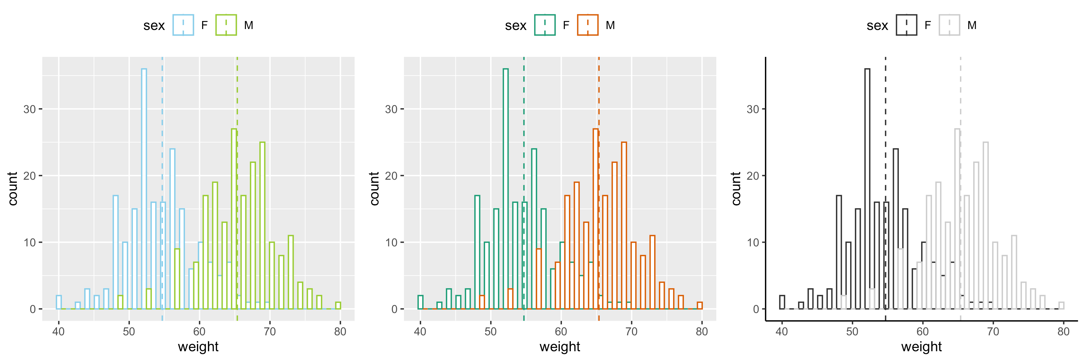
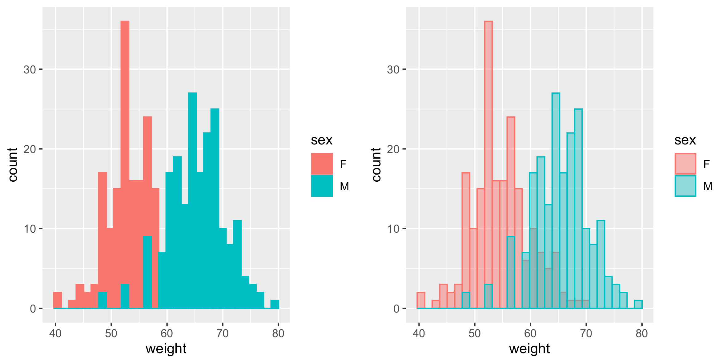
更改填充颜色
直方图的填充颜色可以由sex自动控制:
1 | # 按组更改直方图并填充颜色 |
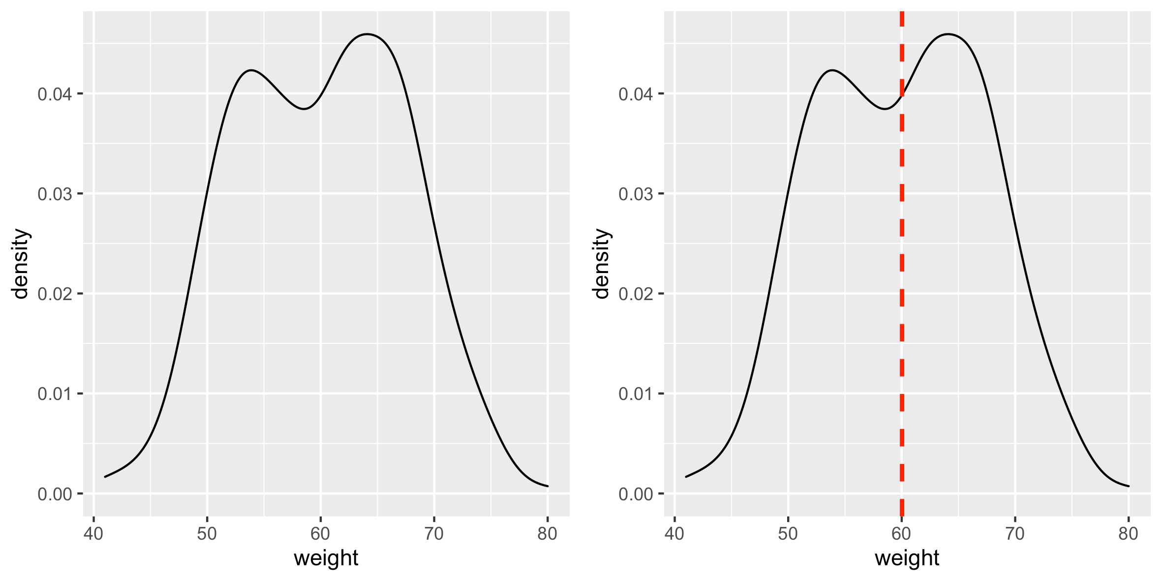
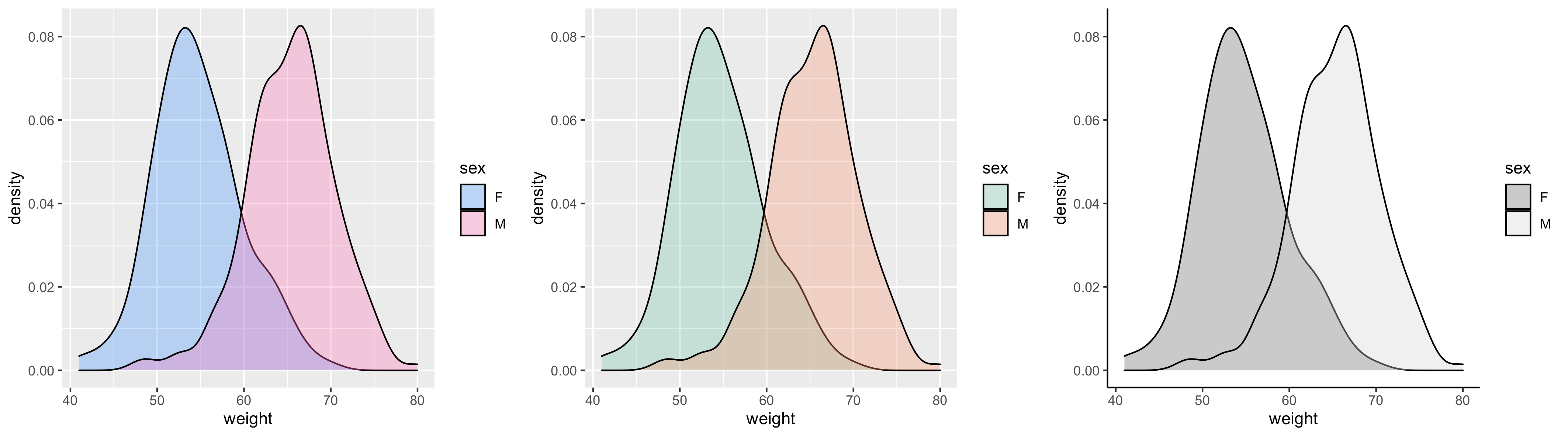
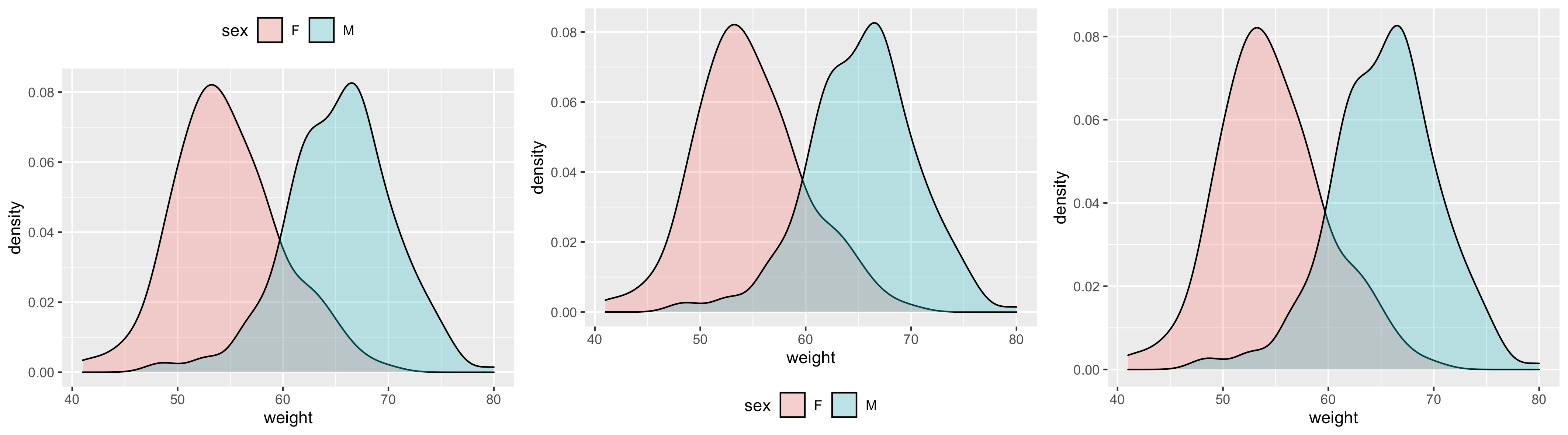
密度图
本R 教程介绍了如何使用 ggplot2包 创建密度图。
使用函数geom_density()
准备数据
1 | set.seed(1234) |
基本密度图
1 | library(ggplot2) |
更改密度图线类型和颜色
1 | # 改变密度图线的类型以及填充颜色 |
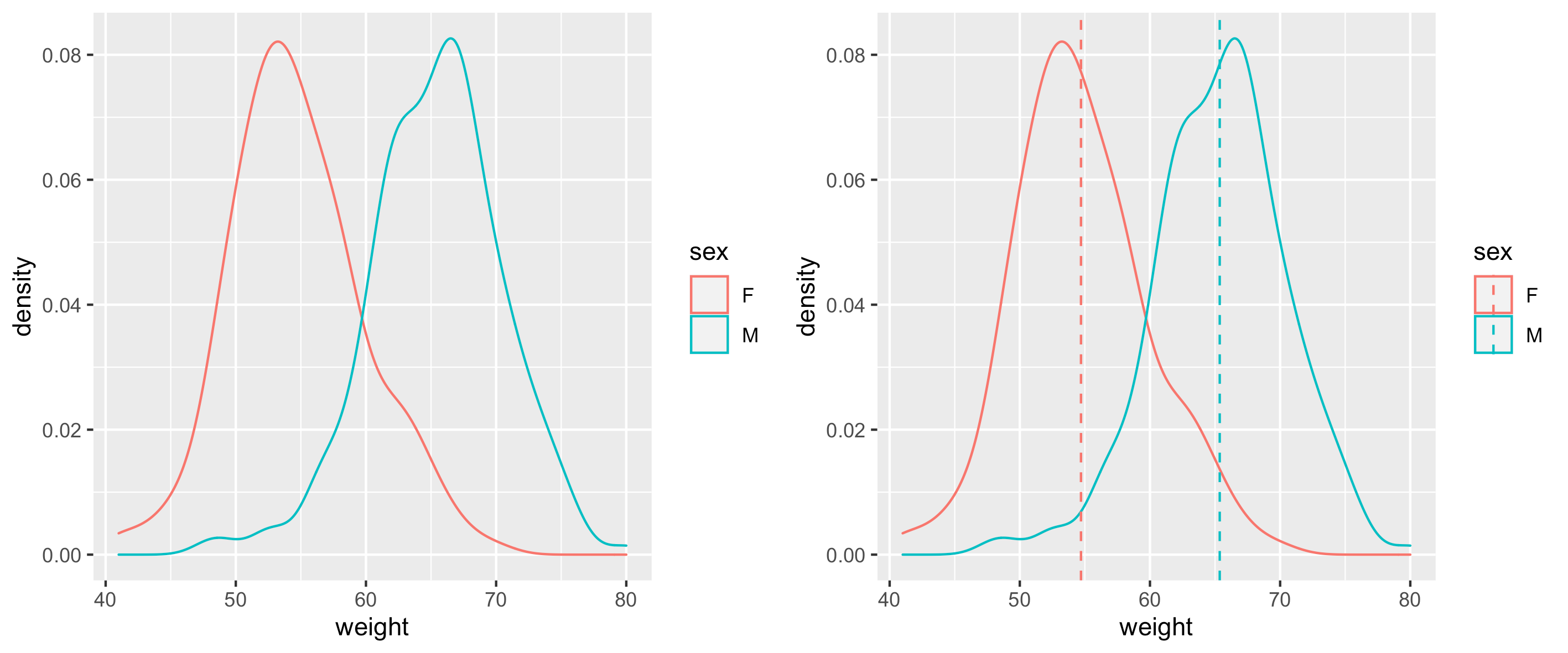
按组更改密度图颜色
计算每组的平均值
1 | library(plyr) |
更改线条颜色
密度图线的颜色可以通过 sex 自动控制:
1 | # 根据分组改变密度图线的颜色 |
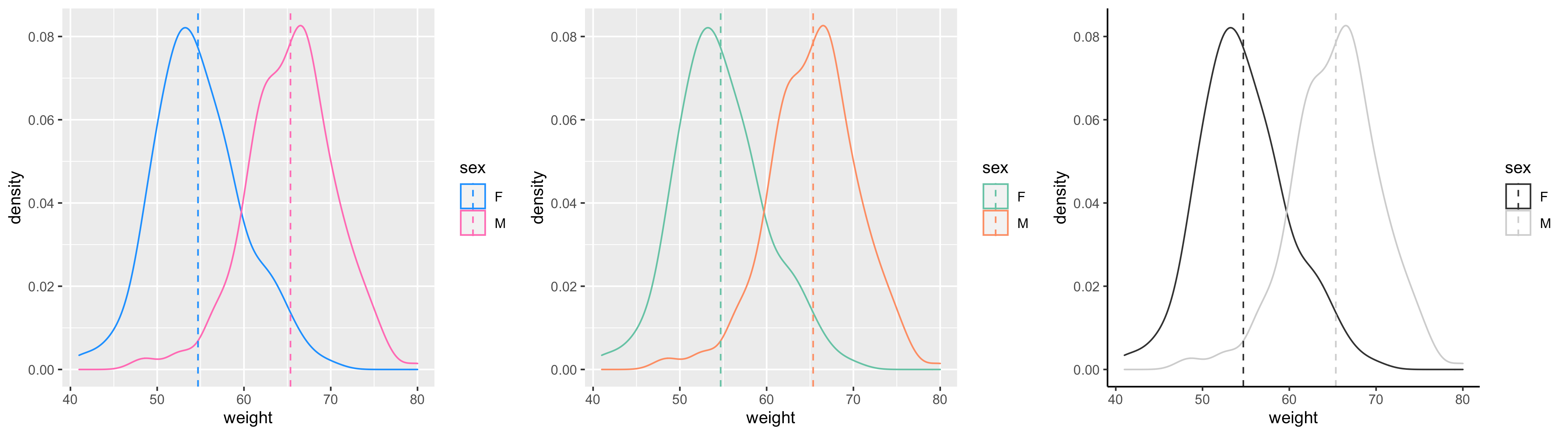
也可以使用以下函数手动更改密度图线颜色:
scale_color_manual() : 使用自定义颜色
scale_color_brewer():使用RColorBrewer包的调色板
scale_color_grey():使用灰色调色板
1 | # 使用自定义颜色 |
更改填充颜色
密度图填充颜色可以由 sex 自动控制
1 | # 根据分组改变密度图填充颜色 |
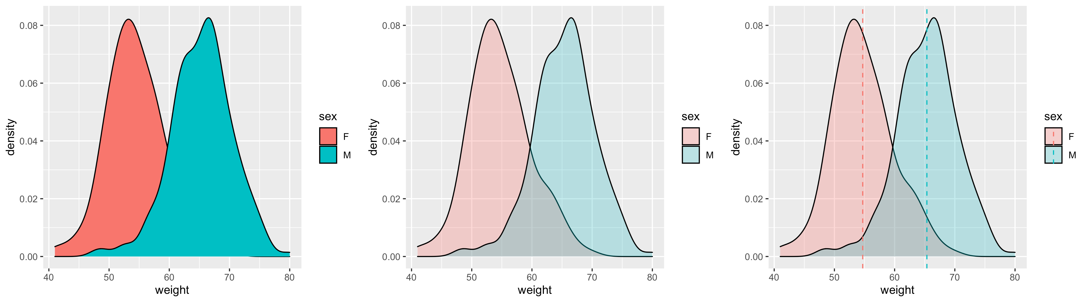
手动更改密度图填充颜色:
1 | # 使用自定义颜色 |
更改图例位置
1 | test2 + theme(legend.position="top") |
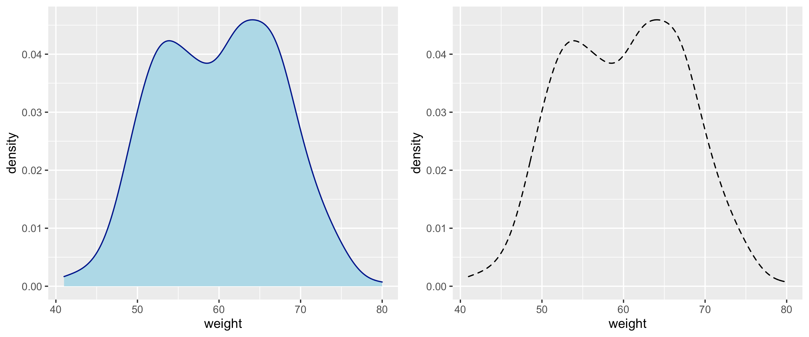
结合直方图和密度图
下面是直方图结合密度图的组合图
1 | # 结合直方图和密度图 |

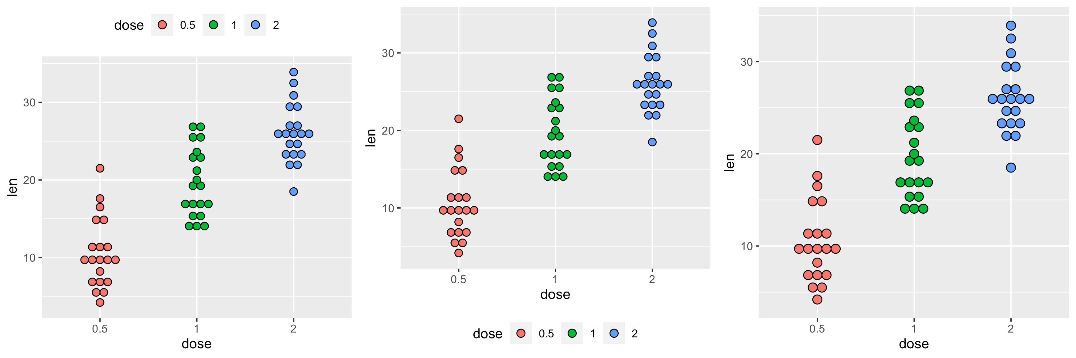
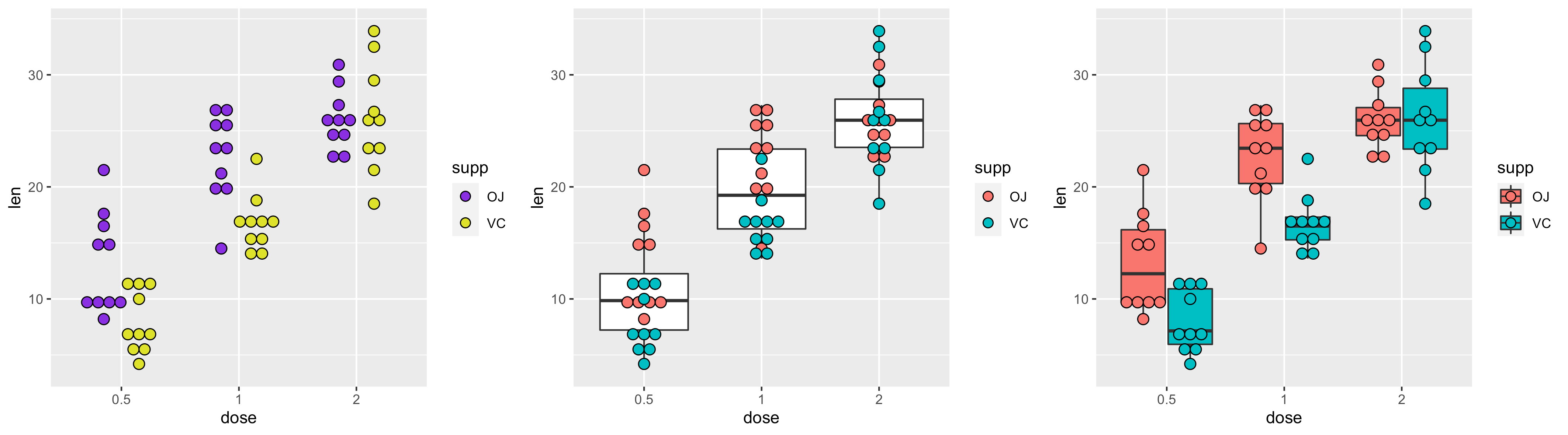
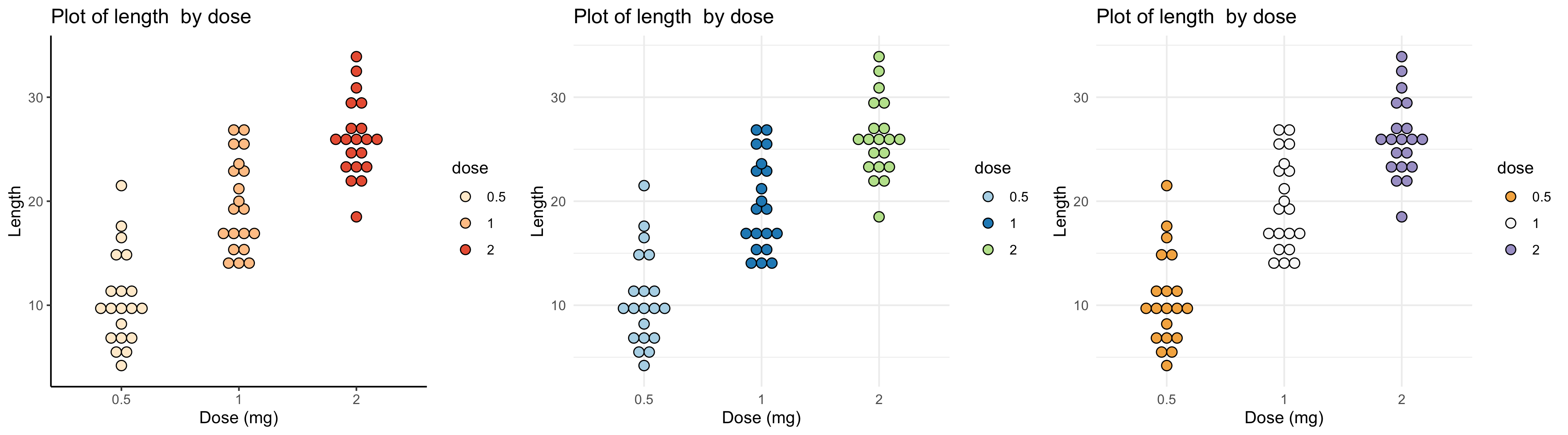
点图
本R 教程介绍了如何使用 ggplot2包 创建点图。
使用函数geom_dotplot()。
准备数据
使用 ToothGrowth数据集:
1 | ToothGrowth$dose <- as.factor(ToothGrowth$dose) |
基本点图
1 | library(ggplot2) |
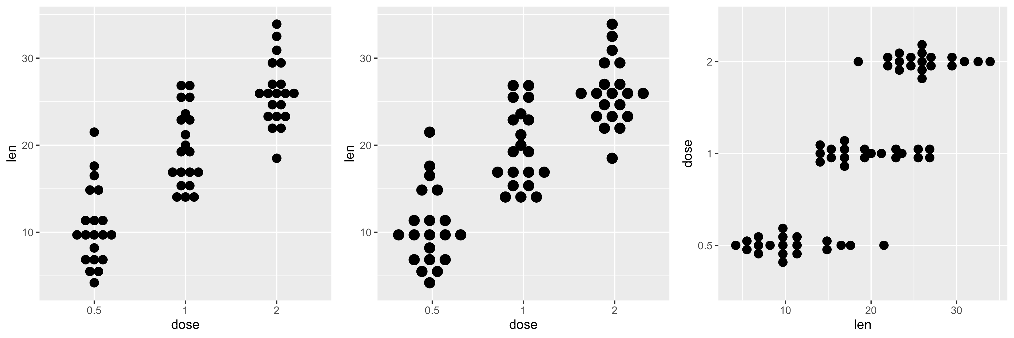
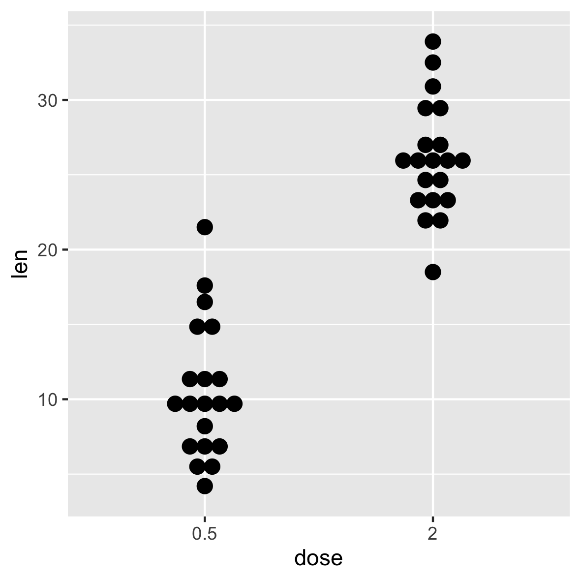
自定义选择想要显示的项目,比如只显示 0.5 和 2 的点图结果
1 | p + scale_x_discrete(limits=c("0.5", "2")) |
在点图上添加汇总统计
函数stat_summary()可用于向点图添加均值/中值点等
带箱线图和小提琴图的点图
1 | # 添加基本的箱线图 |
添加均值和标准差
使用函数 mean_sdl 。 mean_sdl 计算平均值加上或减去一个常数乘以标准偏差。
在下面的R代码中,常数是使用参数 mult(mult=1) 指定的。默认情况下,mult=2 。
平均值 +/- SD 可以添加为 crossbar 或 pointrange :
1 | p <- ggplot(ToothGrowth, aes(x=dose, y=len)) + |
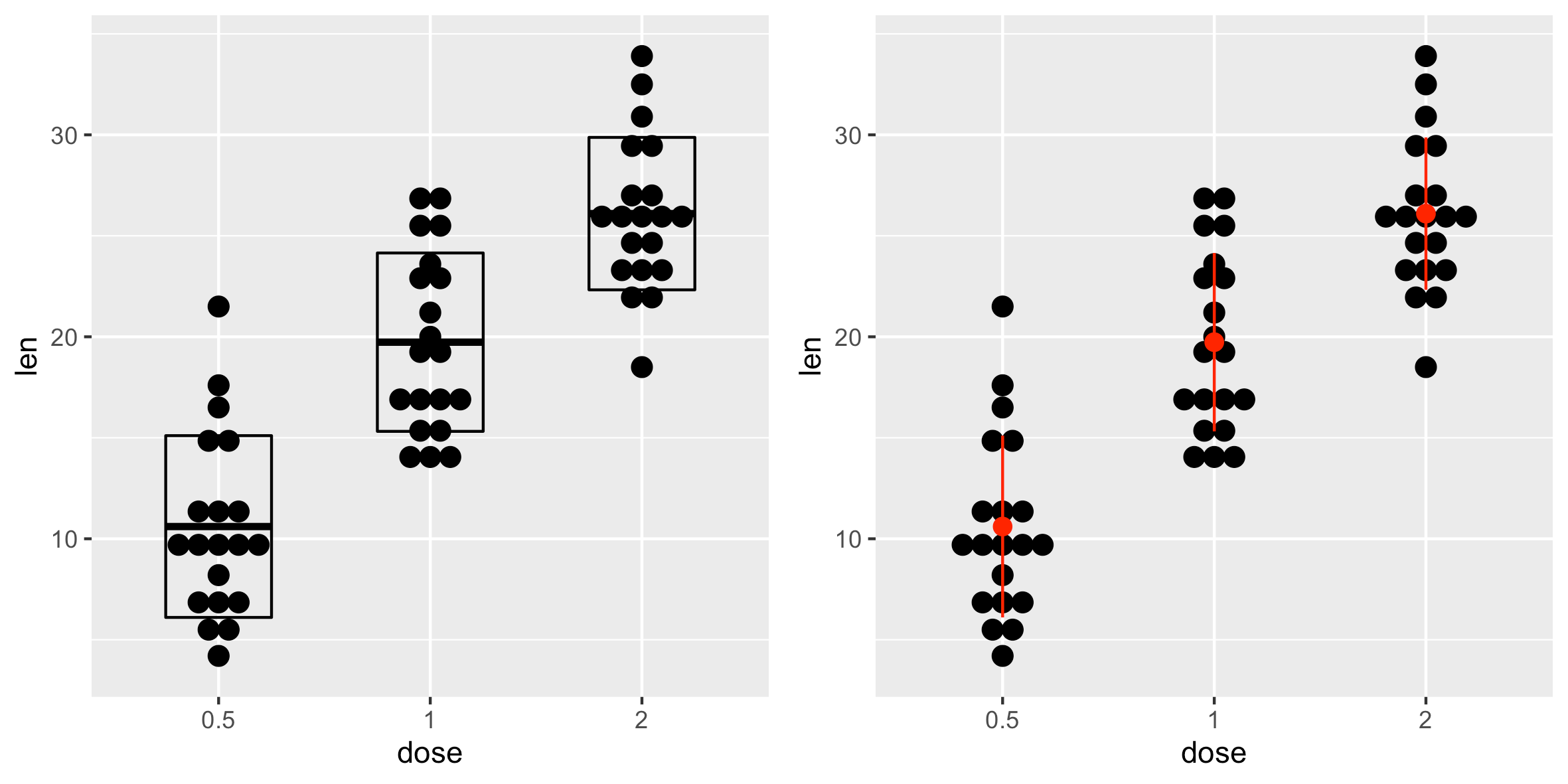
还可以定义一个自定义函数来生成如下汇总统计信息。
1 | # 生成汇总统计数据的函数(平均值和 +/- sd) |
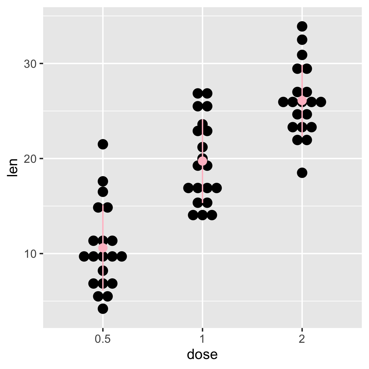
使用自定义汇总函数:
1 | p + stat_summary(fun.data=data_summary, color="pink") |
按组更改点图颜色
这一步和之前的直方图以及密度图所用的方法是一样的,这里不再赘述了,可以查看我之前的教程内容。
1 | # 使用单一填充颜色 |
使用以下函数手动更改点图颜色:
scale_fill_manual() : 使用自定义颜色
scale_fill_brewer() :使用来自RColorBrewer包的调色板
scale_fill_grey() :使用灰色调色板
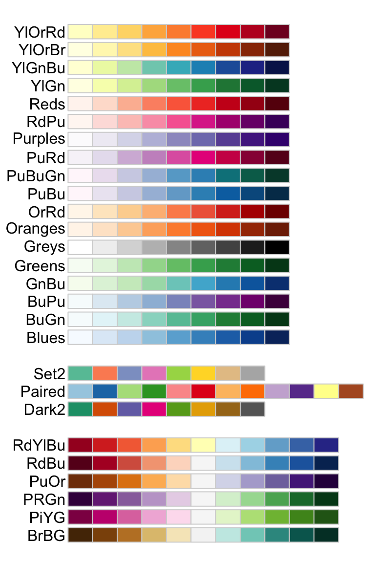
补充一下 RColorBrewer 包所支持的颜色类型名称
1 | # 使用自定义颜色 |

更改图例位置
1 | p + theme(legend.position="top") |
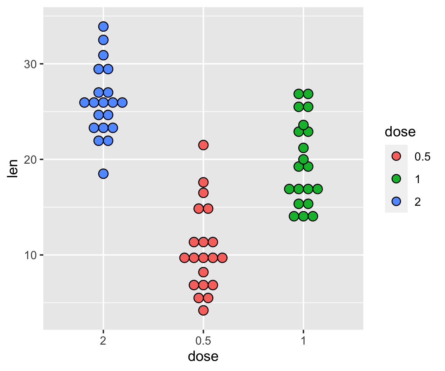
更改图例中项目的顺序
函数 scale_x_discrete 可将顺序更改为“2”、“0.5”、“1”:
1 | p + scale_x_discrete(limits=c("2", "0.5", "1")) |
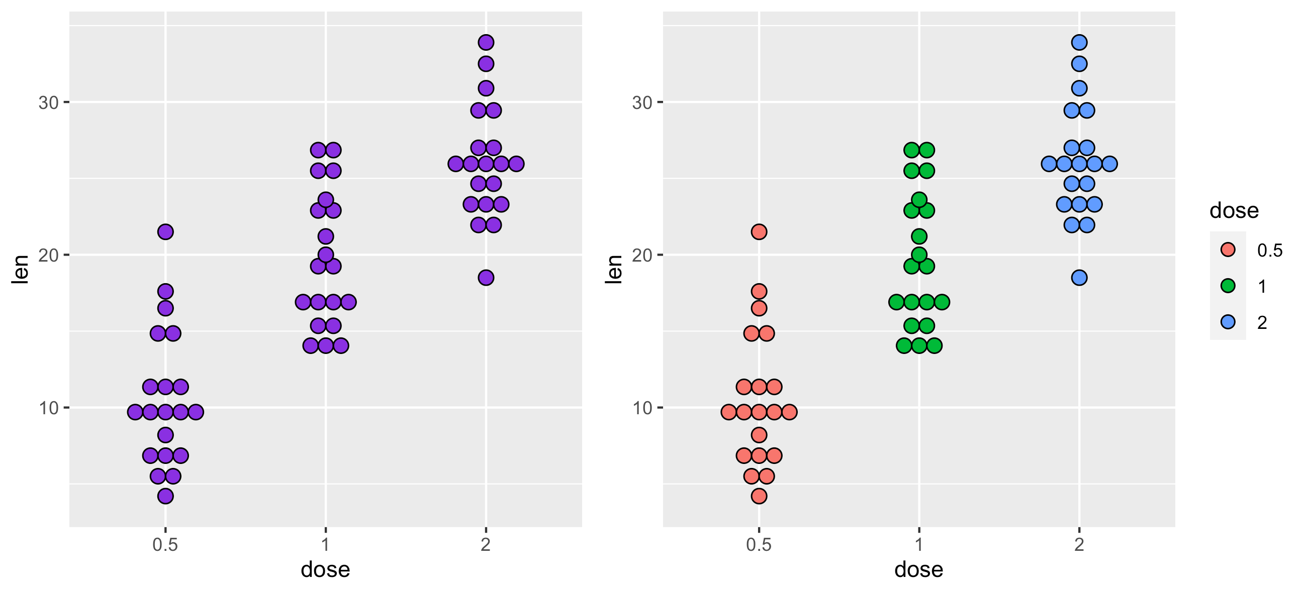
多组点图
1 | # 按组更改点图颜色 |
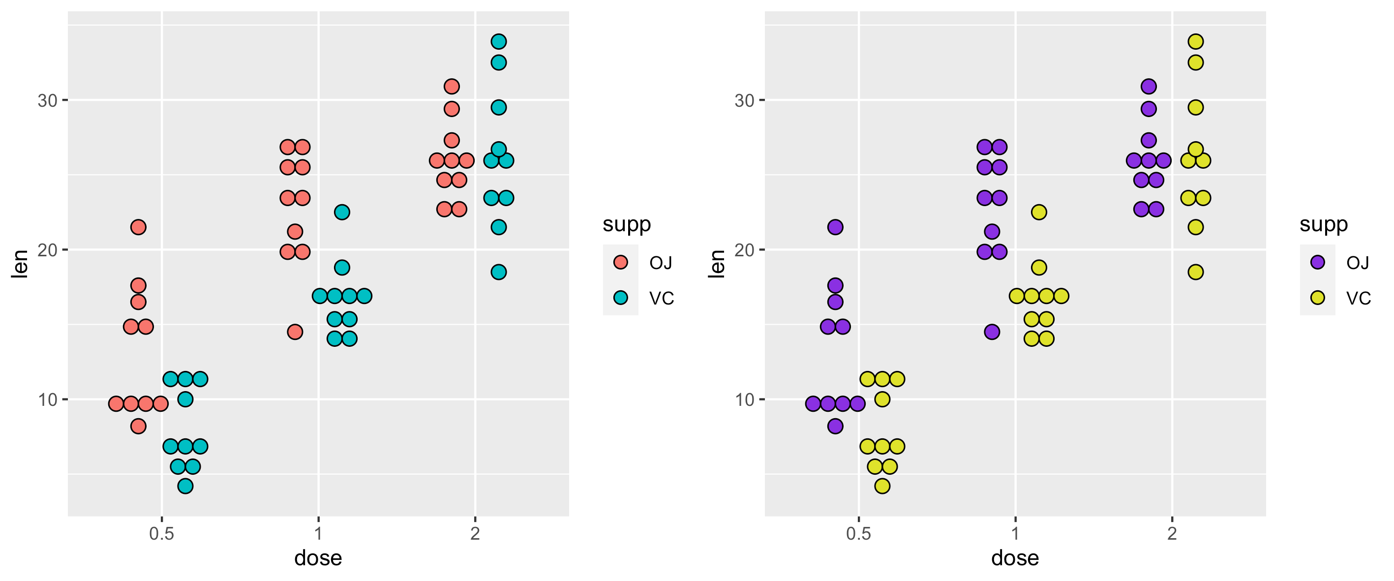
更改点图颜色并添加箱线图:
1 | # 更改颜色 |
自定义点图
1 | # 基础点图 |
1 | # 连续颜色 |
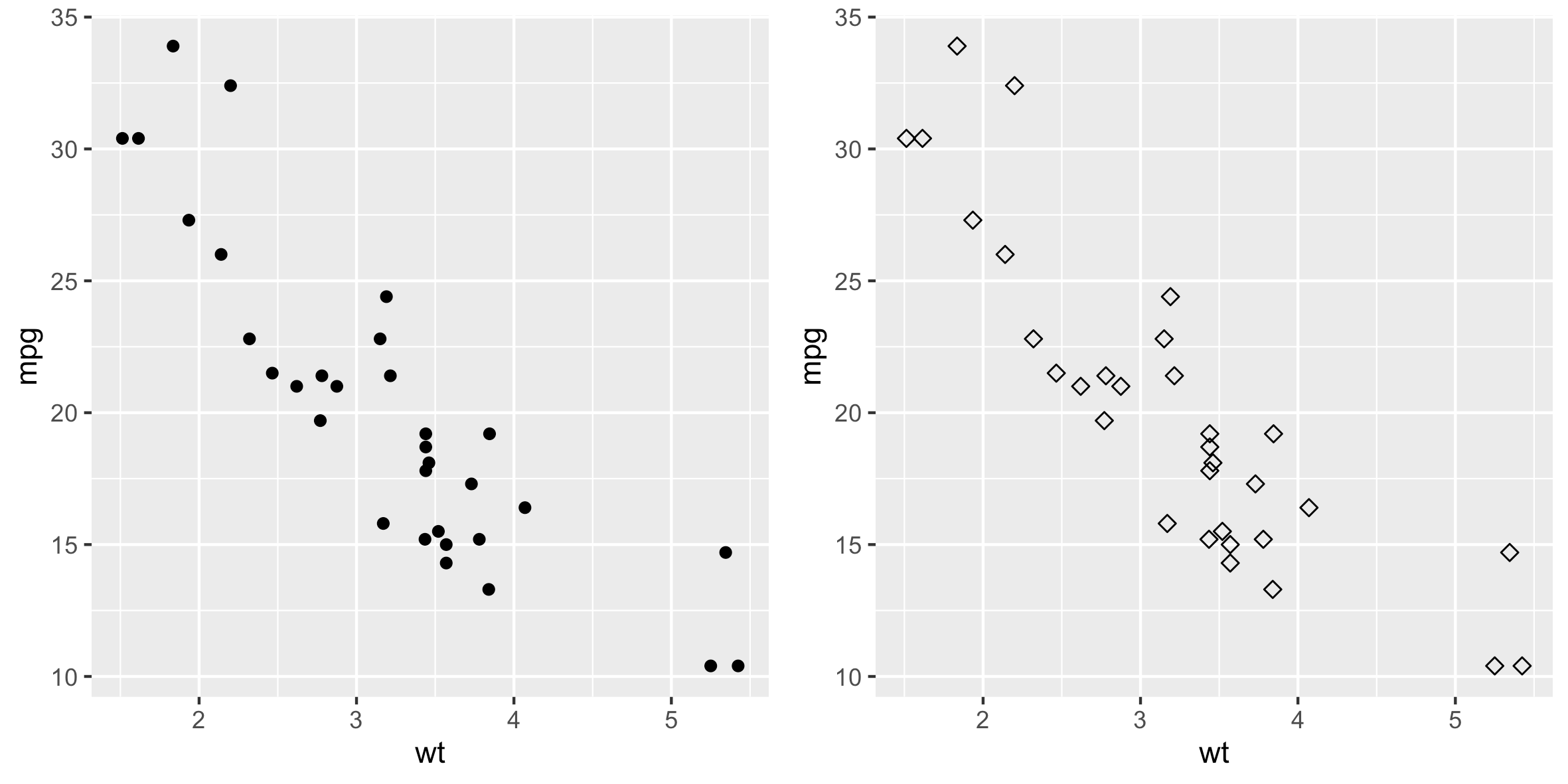
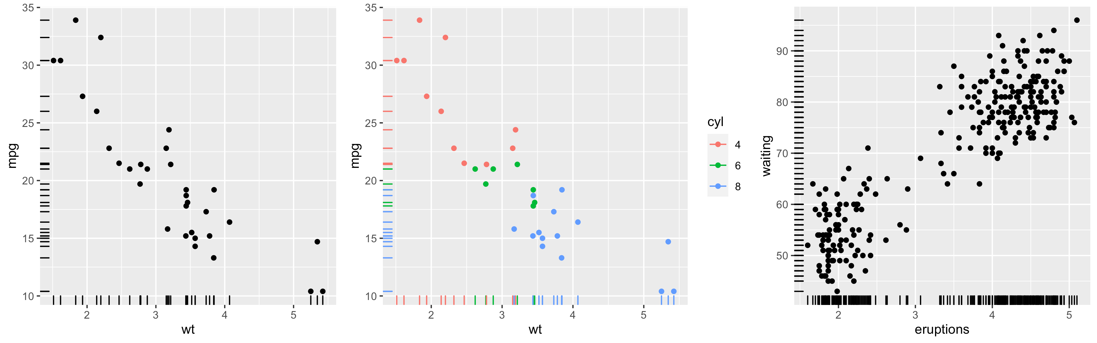
散点图
本文介绍如何使用ggplot2包创建散点图。使用函数·geom_point()。
准备数据
以下示例中使用了mtcars数据集
1 | # 将 cyl 列从数值型(numeric)转换为因子变量(factor variable) |
基本散点图
使用下面的 R 代码创建简单的散点图。
可以使用函数geom_point()更改点的颜色、大小和形状,如下所示:
1 | geom_point(size, color, shape) |
1 | library(ggplot2) |
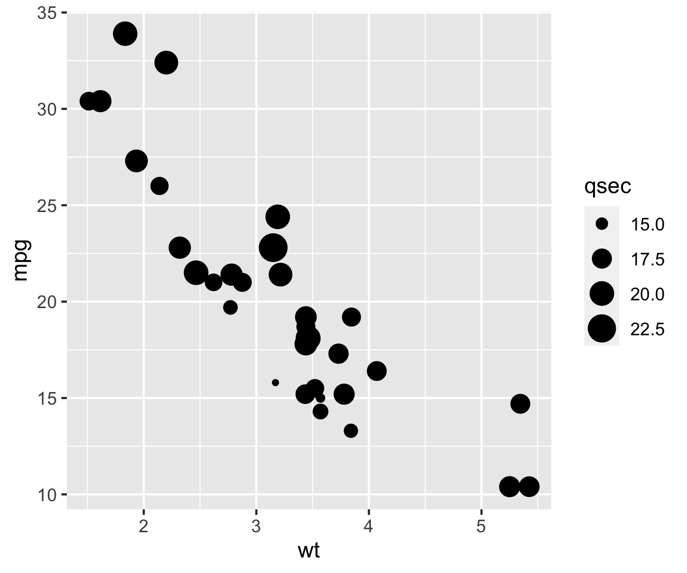
点的大小可以由连续变量的值控制,如下例所示。
1 | # 改变点的大小 |
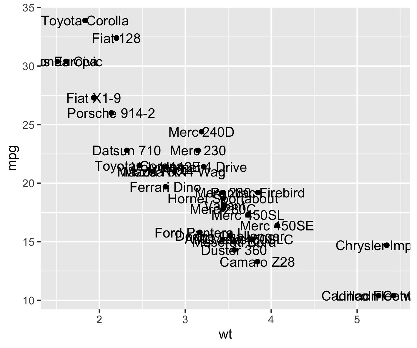
在散点图中标记点
可以使用函数geom_text():
1 | ggplot(mtcars, aes(x=wt, y=mpg)) + |
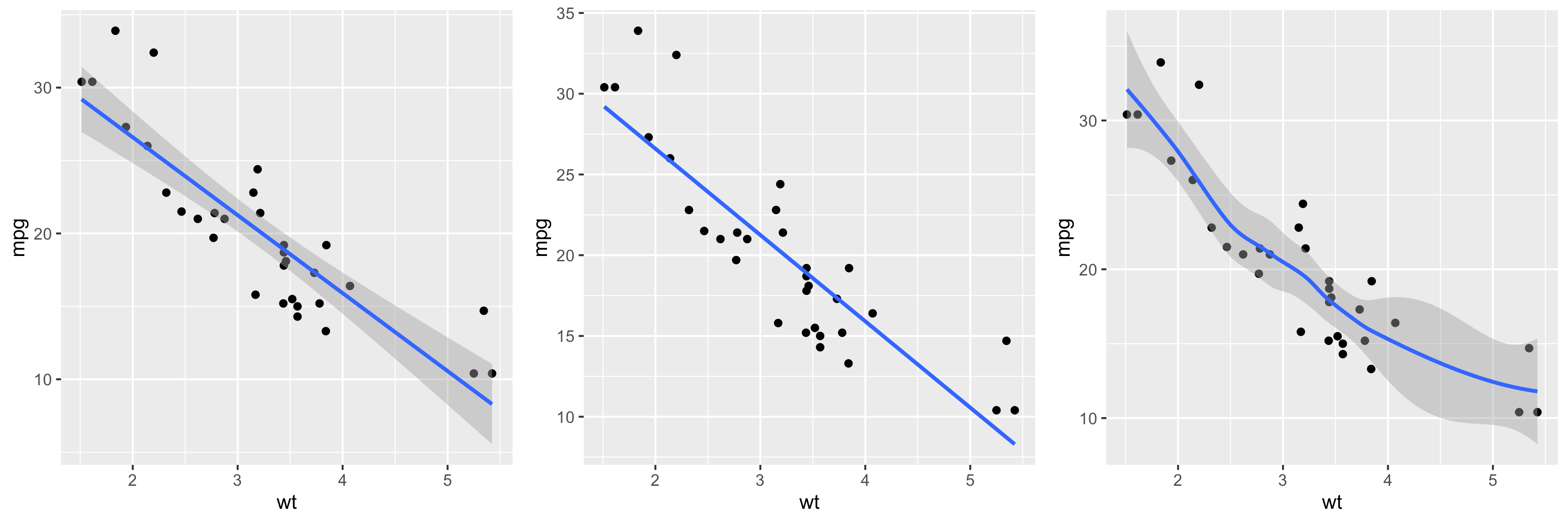
添加回归线
以下函数可用于向散点图添加回归线:
geom_smooth()stat_smooth()
geom_abline()
本节仅介绍geom_smooth()函数。
一个简化的格式是:
1 | geom_smooth(method="auto", se=TRUE, fullrange=FALSE, level=0.95) |
方法
要使用的平滑方法。可能的值为 lm、glm、gam、loess、rlm
- method = “loess”:这是少量观察的默认值。它计算平滑的局部回归。您可以使用 R 代码 ?loess 阅读有关loess 的更多信息。
- method =“lm”:它适合线性模型。请注意,也可以将公式表示为 formula = y ~ poly(x, 3) 以指定 3 次多项式。
- se:逻辑值。如果为 TRUE,则置信区间显示在平滑附近。
- fullrange:逻辑值。如果为 TRUE,则拟合跨越绘图的整个范围
- level:要使用的置信区间水平。默认值为 0.95
1 | # 添加回归线 |
更改点和线的外观
下面介绍如何更改:
- 回归线的线型和颜色
- 置信区间的填充颜色
1 | # 更改线型和颜色 |
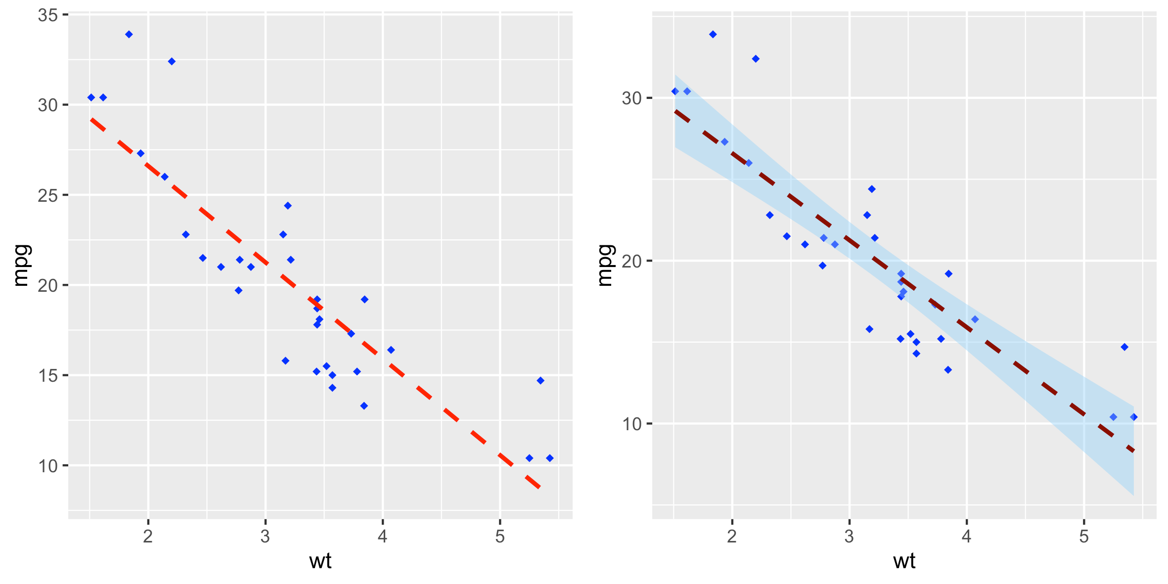
默认情况下,置信带使用透明颜色。可以通过使用参数alpha来改变:
geom_smooth(fill="blue", alpha=1)
多组散点图
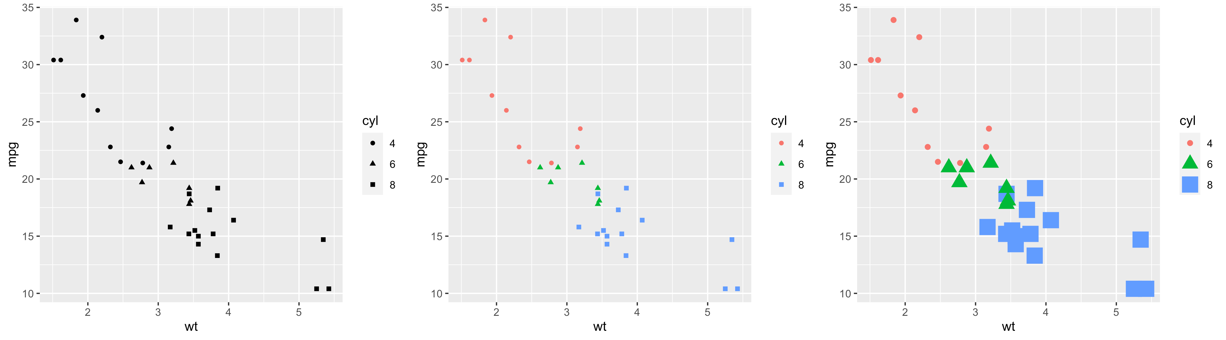
本节介绍如何自动和手动更改点颜色和形状。
自动更改点颜色/形状/大小
在下面的 R 代码中,点的形状、颜色和大小由因子变量cyl的级别控制:
1 | # 通过 cyl 的级别更改点形状 |
添加回归线
可以按如下方式添加回归线:
1 | # 添加回归线 |
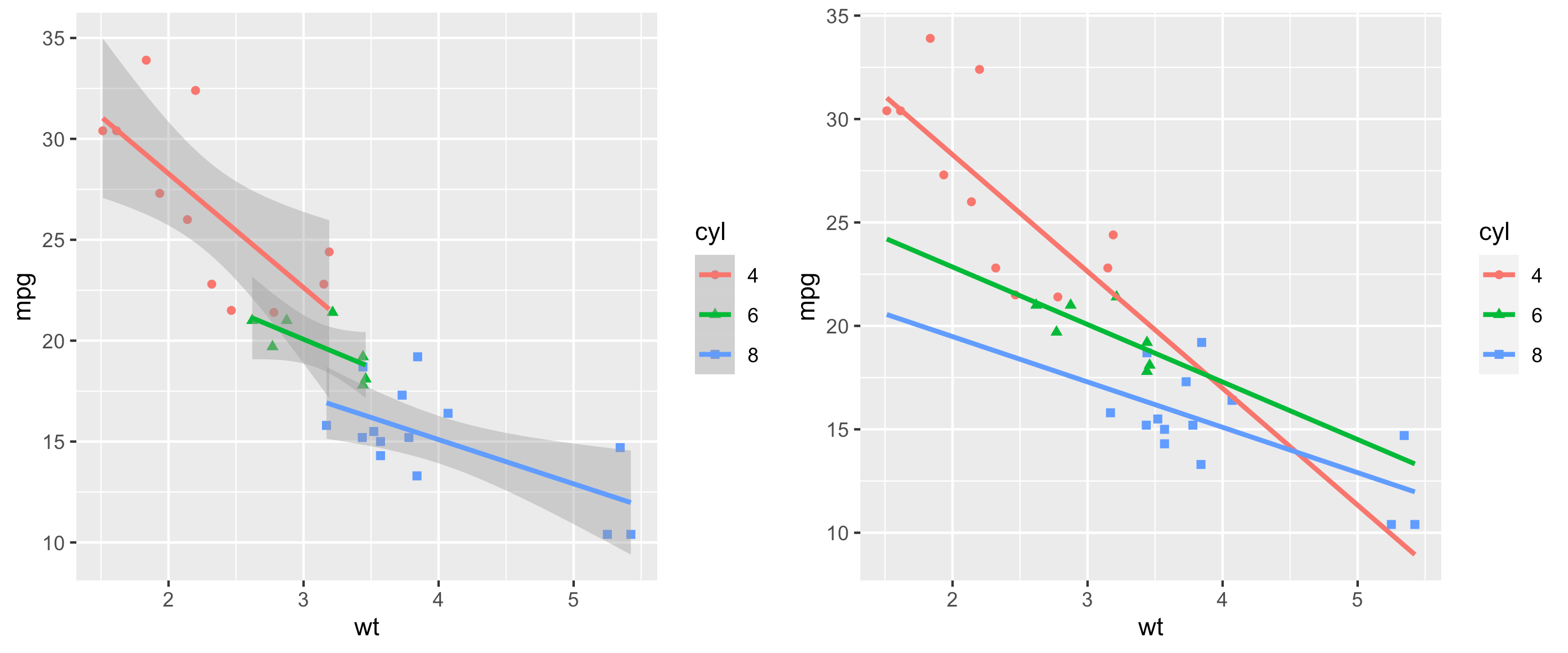
还可以使用美观的
linetype = cyl更改回归线的线型。
置信带的填充颜色可以更改如下:
1 | ggplot(mtcars, aes(x=wt, y=mpg, color=cyl, shape=cyl)) + |
手动更改点颜色/形状/大小
使用了以下功能:
scale_shape_manual()用于点形状scale_color_manual()用于点颜色scale_size_manual()用于点大小
1 | # 手动更改点的形状和颜色 |
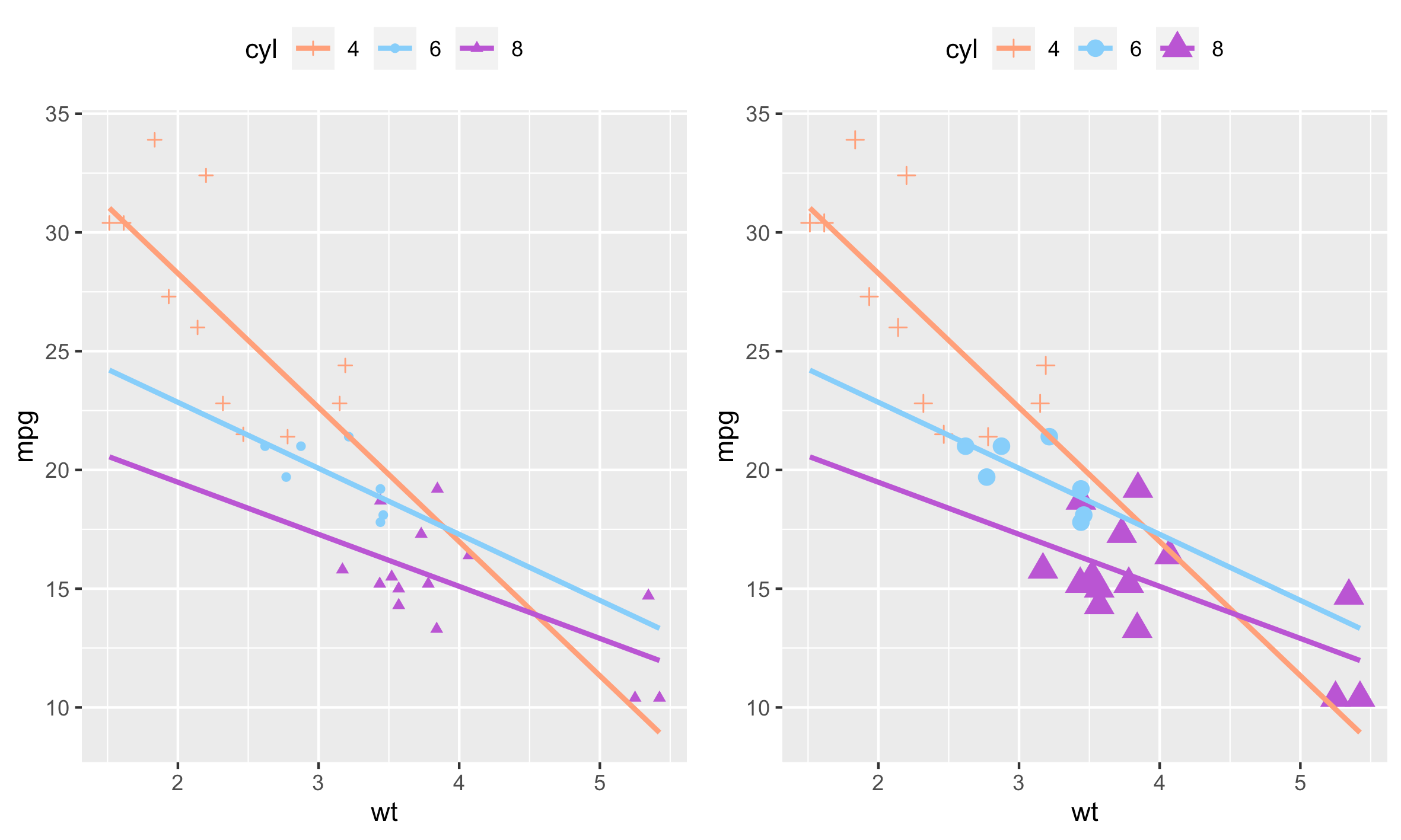
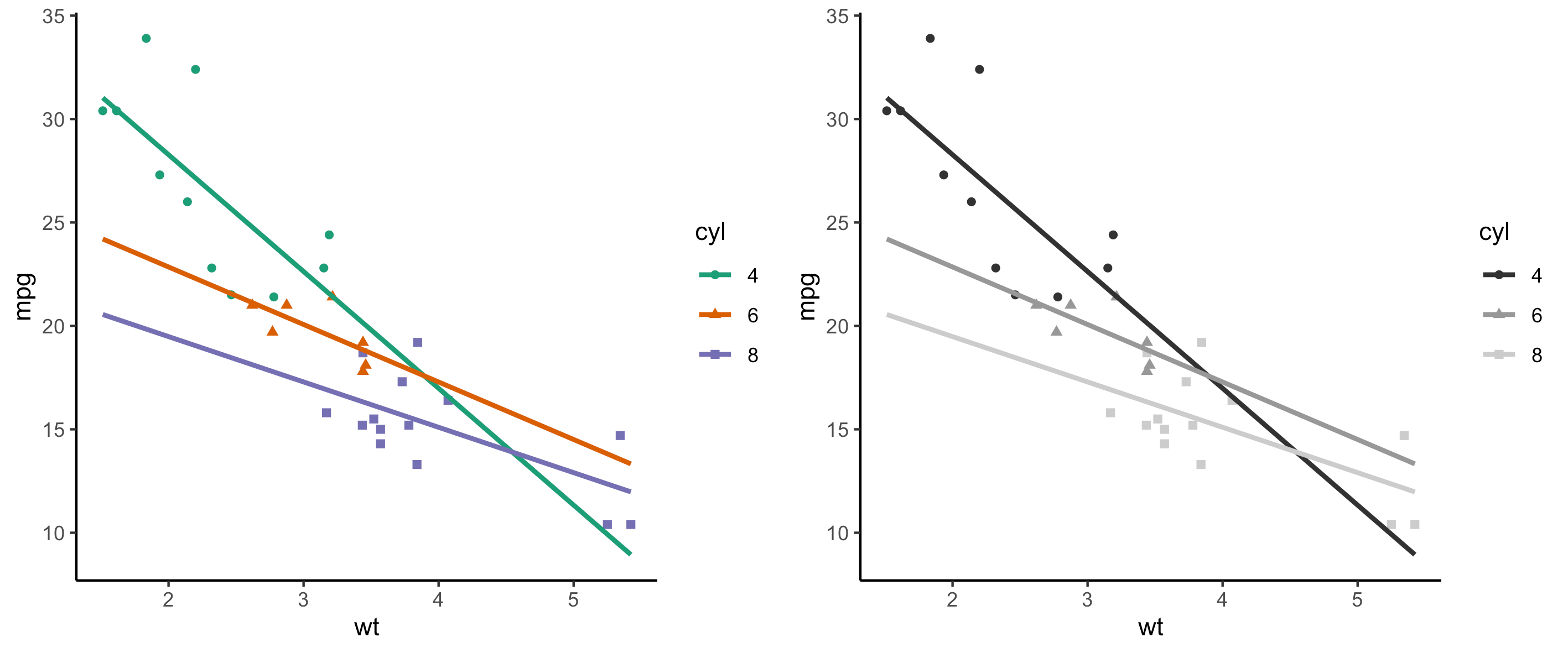
也可以使用以下功能手动更改点和线颜色:
scale_color_brewer():使用来自RColorBrewer包的调色板scale_color_grey():使用灰色调色板
1 | p <- ggplot(mtcars, aes(x=wt, y=mpg, color=cyl, shape=cyl)) + |
将联合分布图添加到散点图
可以使用函数geom_rug():
1 | geom_rug(sides ="bl") |
side:一个字符串,用于控制出现在哪一边。允许的值是一个字符串,其中包含 trbl 中的任何一个,用于顶部、右侧、底部和左侧。
1 | # 添加联合分布图(marginal rugs) |
具有 2D 密度评估的散点图
可以使用函数geom_density_2d()或stat_density_2d():
1 | # 具有二维密度估计的散点图 |
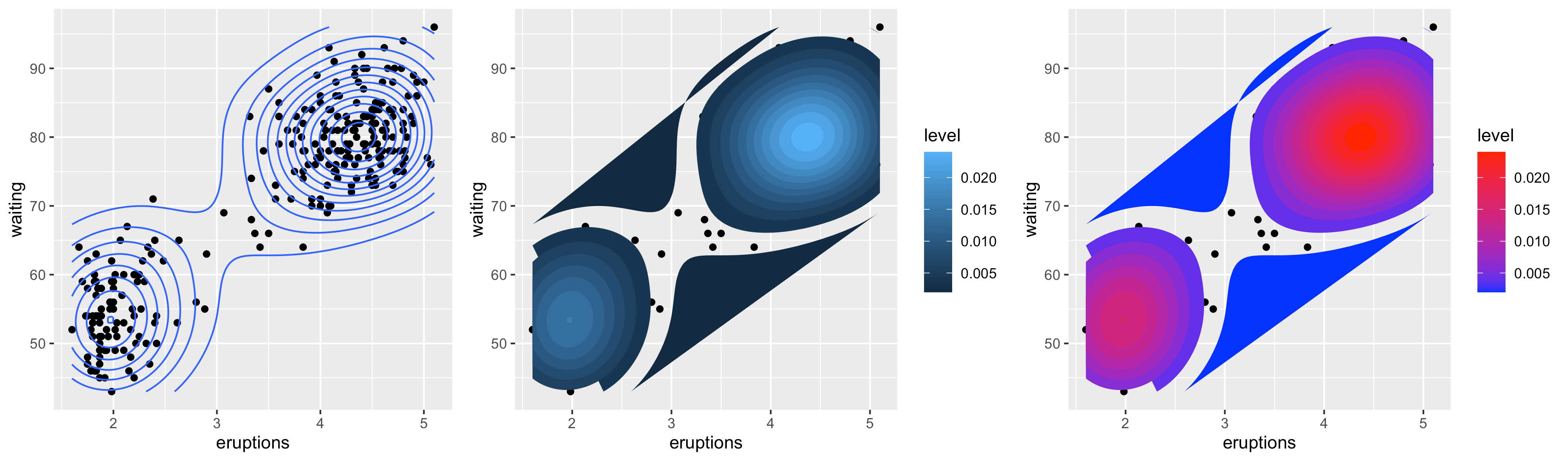
带椭圆的散点图
函数stat_ellipse()可以如下使用:
1 | # 一个椭圆环绕所有点 |

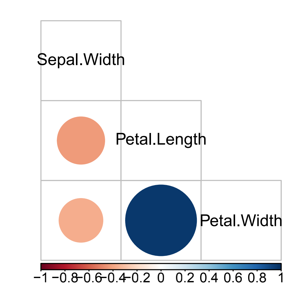
多重相关图
1 | data(iris) |
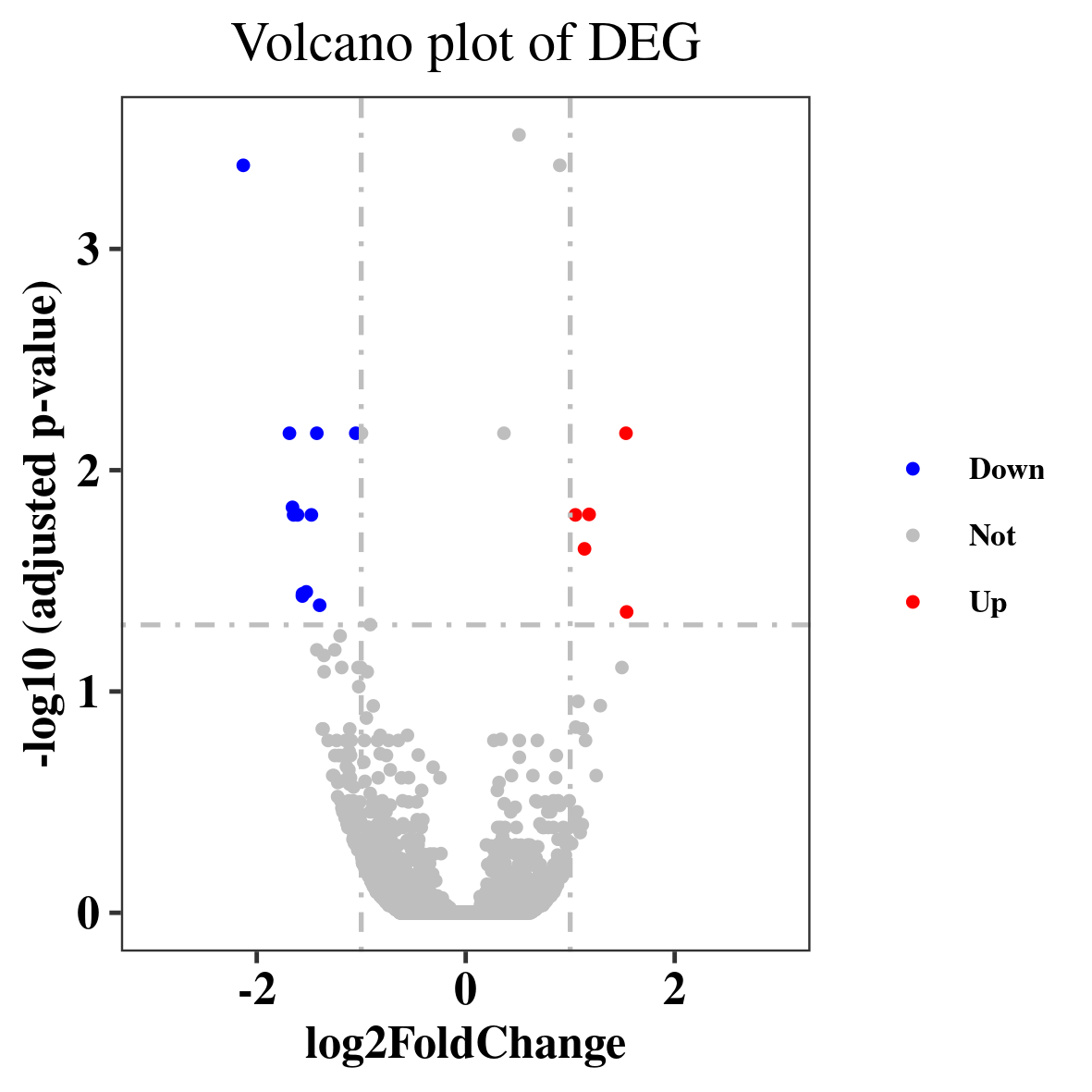
火山图
1 | > head(df3) |
1 | df3$threshold <- as.factor(ifelse(df3$padj < 0.05 & abs(df3$log2FoldChange) >=1,ifelse(df3$log2FoldChange > 1 ,'Up','Down'),'Not')) |
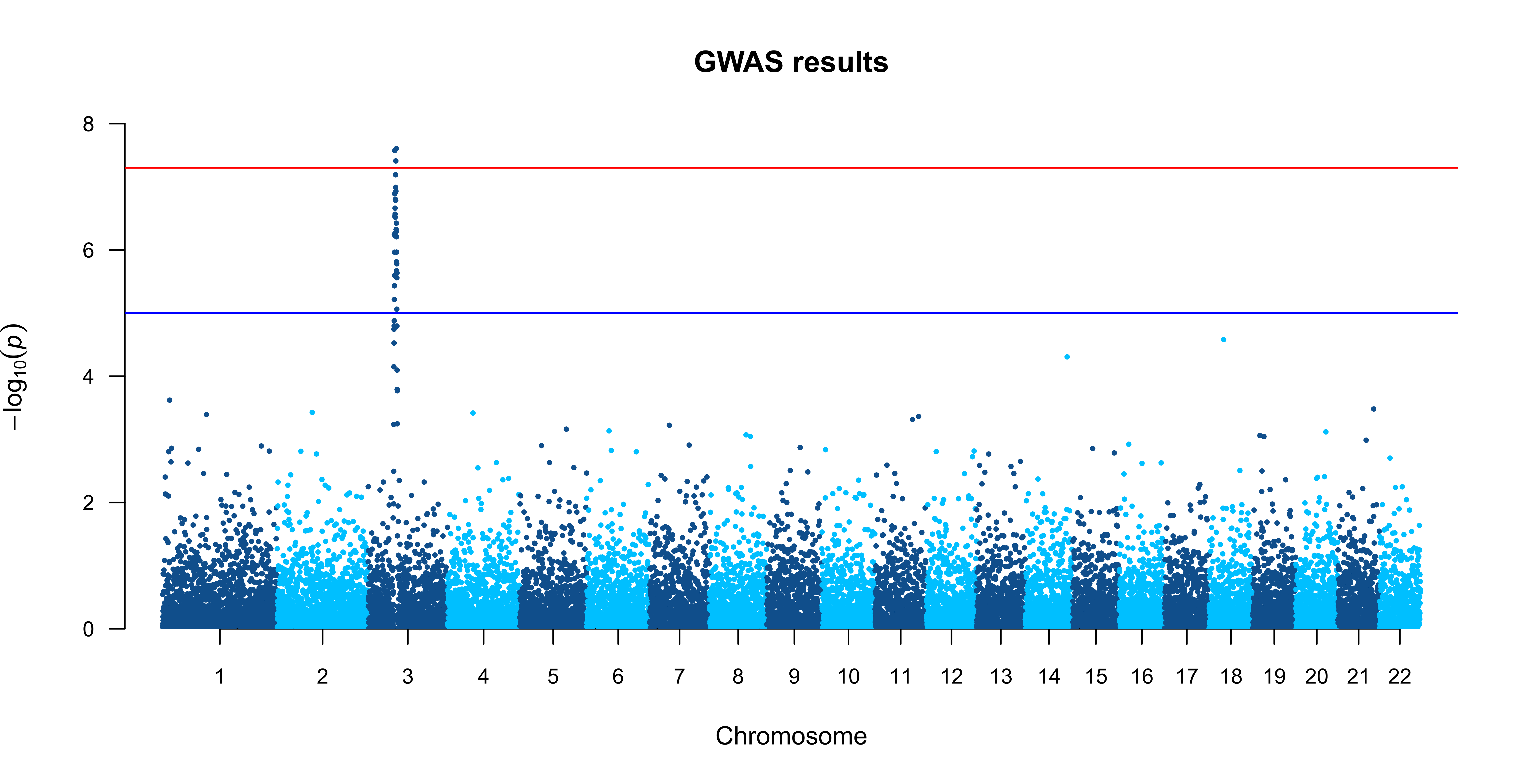
曼哈顿图
1 | > head(df4) |
1 | manhattan(df4, main = "GWAS results", ylim = c(0, 8), |
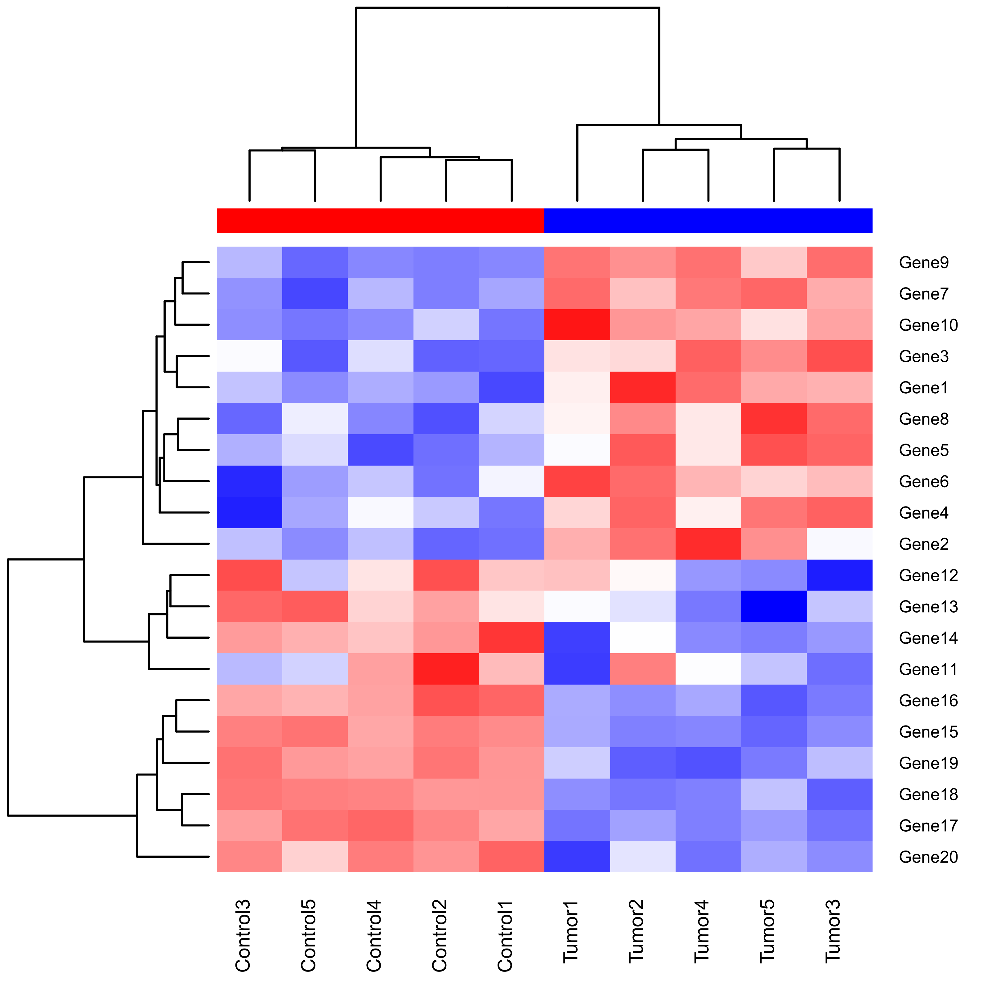
热图
使用ggplots包heatmap.2()函数绘制热图
1 | > head(dm) |
1 | ##为了以红色绘制高表达式值,在热图中使用colorRampPalette而不是heatmap.2 |
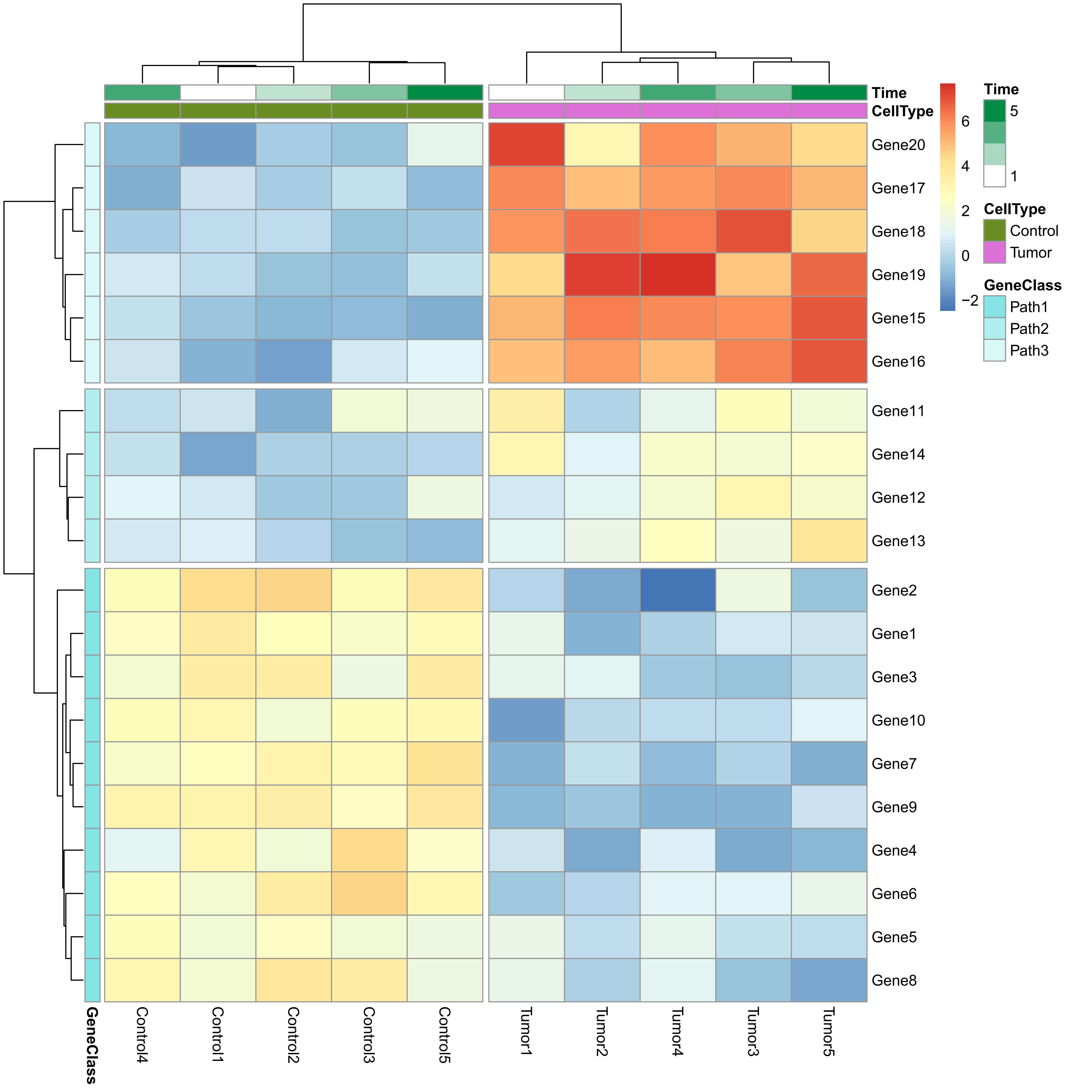
使用pheatmap包的pheatmap函数绘制热图
1 | ##add column and row annotations |
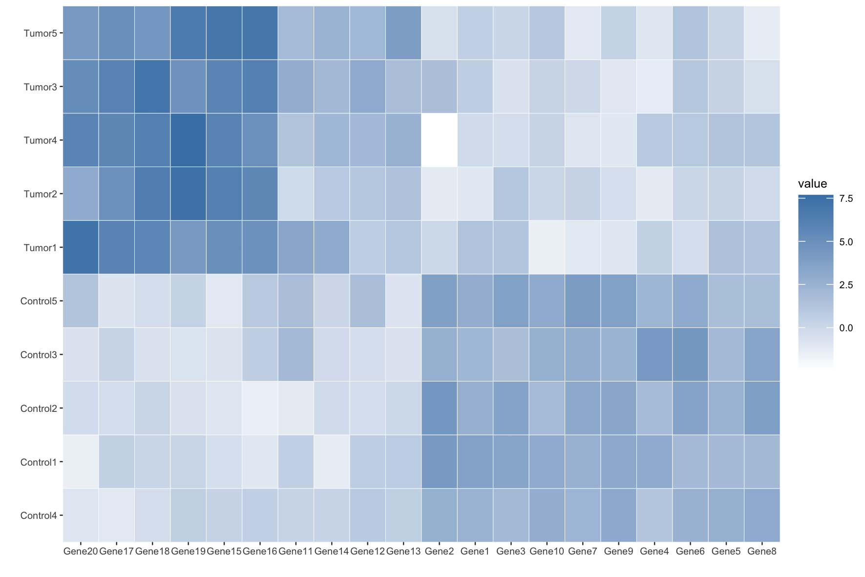
使用ggplot2软件包绘制热图
1 | ##9.3.1.cluster by row and col |
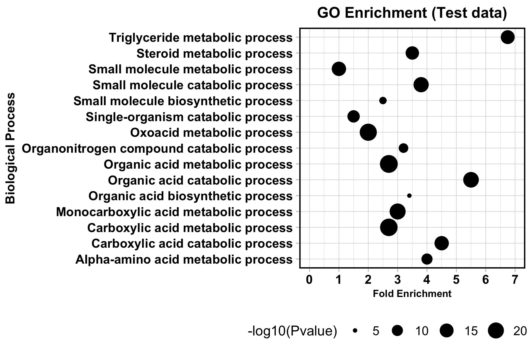
气球图
基础气球图制作
1 | > head(df6) |
1 | ggplot(df6, aes(x=Fold.enrichment, y=Biological.process)) + |
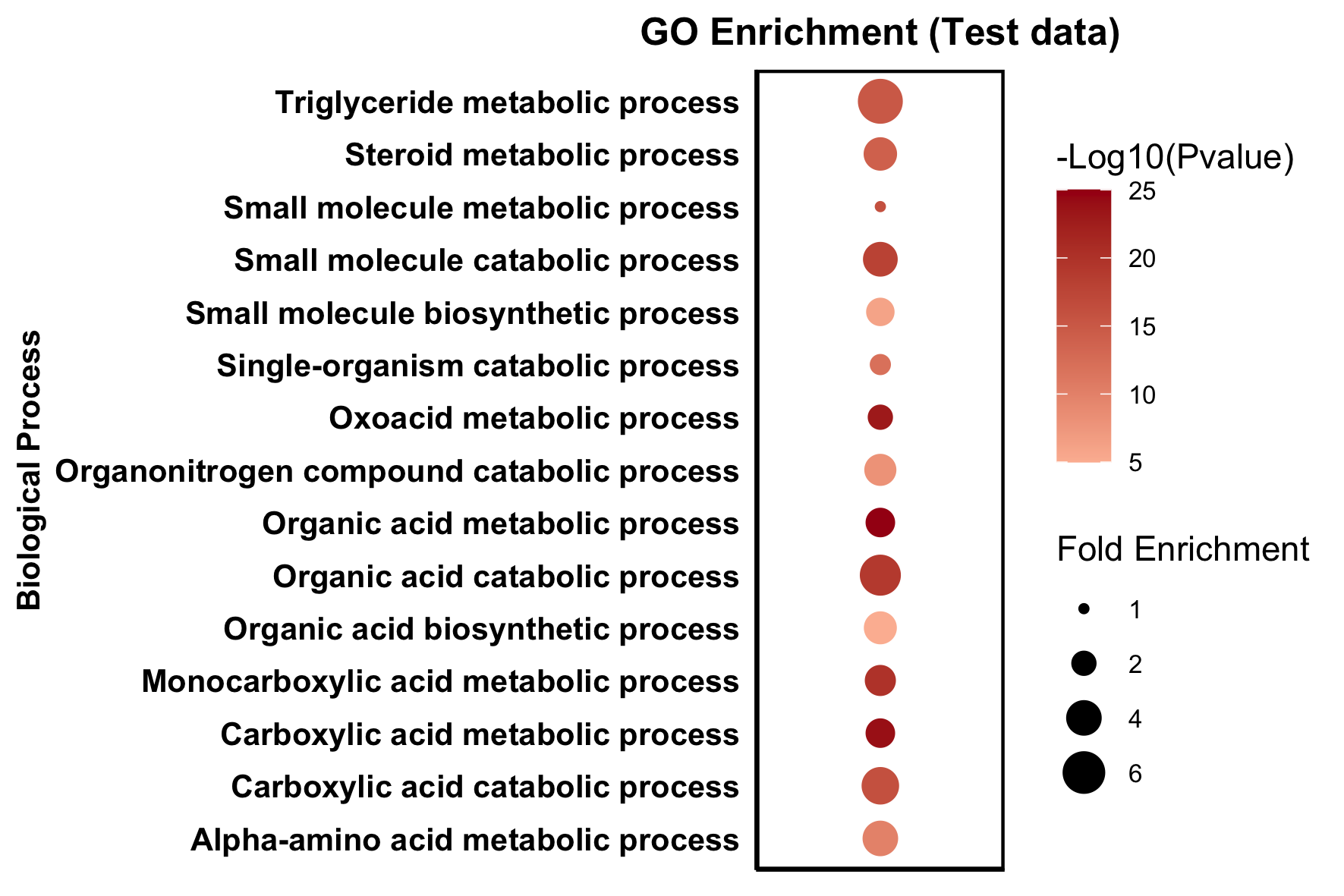
改变点的颜色
1 | ggplot(df6, aes(x=col, y=Biological.process,color=X.log10.Pvalue.)) + |
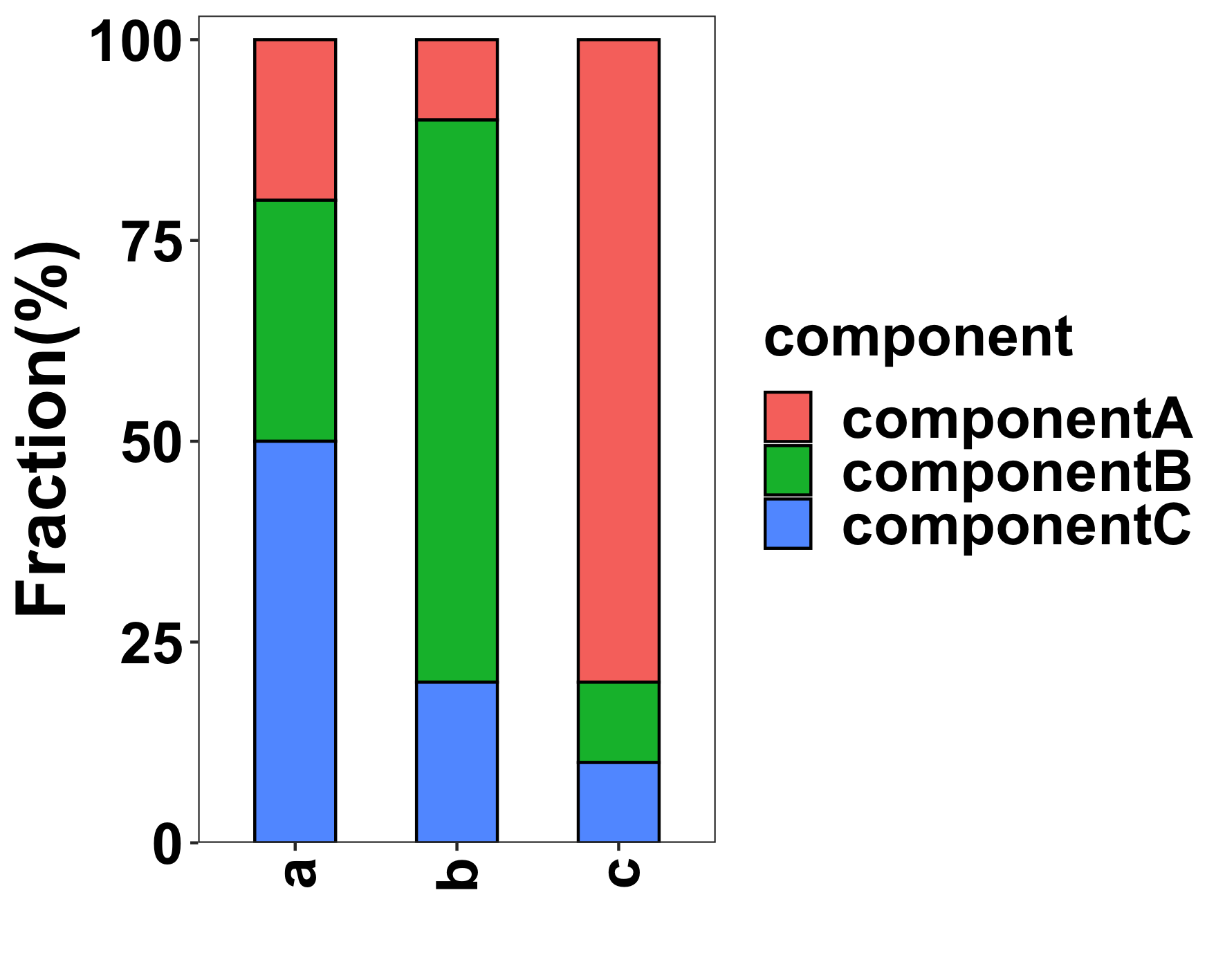
组合条形图
1 | library(reshape2) |

堆积条形图
1 | #build example matrix |
 微信
微信 支付宝
支付宝